Use Only Great Course Images: Follow These Do’s and Don’ts
Rocky Kev
Higher education has hardly evolved in the past few years.
There are still giant auditoriums where professors listen to themselves speak for 3 hours. There are still instructors who read from the book and quietly mumble “Any questions?” before quickly moving on. There are still educators who blame the student if they’re failing.
It sucks for students. It sucks for the professors. It sucks for everybody.
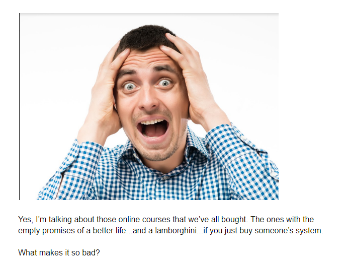
And the worst part is: this mediocrity is invading online education!
Yes, I’m talking about those online courses we’ve all bought. The ones with the empty promises of a better life… and a Lamborghini… if you just buy their system.
What makes it so bad?
(Warning: Mini-rant ensuing.)
They have the nerve to call themselves online courses when they are just info dumps.
Like the professor who lectures just to hear his own voice, these course creators are not interested in creating change. They just want to shove as much information in your head, so you don’t regret spending your money on them.
But if you truly want to teach, educate, provide clarity, and create change, then you need to make your course as engaging as possible. And that’s getting harder nowadays since in an online course, you’re not physically present to command the learner’s attention.
So how do you foster true learning, you ask?
By focusing on your course’s visuals.
One study on active learning revealed that the average person retains 10-20% of a spoken lecture after three days. Pathetic!
But when you add visuals, the retention climbs to 65%! Higher retention means a higher success rate. Which is good for both your students and you.
But there’s a second piece to this.
It’s a no-brainer to add images. But it’s not about spicing up your course with any old images. The wrong types of imagery can backfire, making your students even more perplexed than ever.
Great imagery breaks down hard-to-understand concepts and allows students to absorb your training.
The Power of Visuals
On a quiet Sunday, I watched a course called How to Play Guitar.
The introductory video was so mesmerizing that I got sucked in and ended up watching the entire 10-day course in just a few hours.
The visuals were well done. The edits shifted between the instructor and close ups of the guitar. And the visuals reinforced the training.
The successful mashup of his teaching and his visual breakdowns made me GET IT! Now, if a man threatened me at gunpoint to play “Stairway To Heaven,” I think I can strum my way out of it.
BTW, I don’t even own a guitar!
How would you like your courses to be as effective and memorable as that guitar course? Learn how to use visuals to mesmerize your students and reinforce the change they will experience with your course.
7 Do’s and Don’ts to Course Images That Don’t Suck
I’ve broken this guide into two parts: Don’ts and Do’s. Let’s start with the Don’ts first so we can nip bad habits in the bud. Then we’ll talk about the Do’s, so your visuals will make the best impact for your students.
1. DON’T Be Boring.
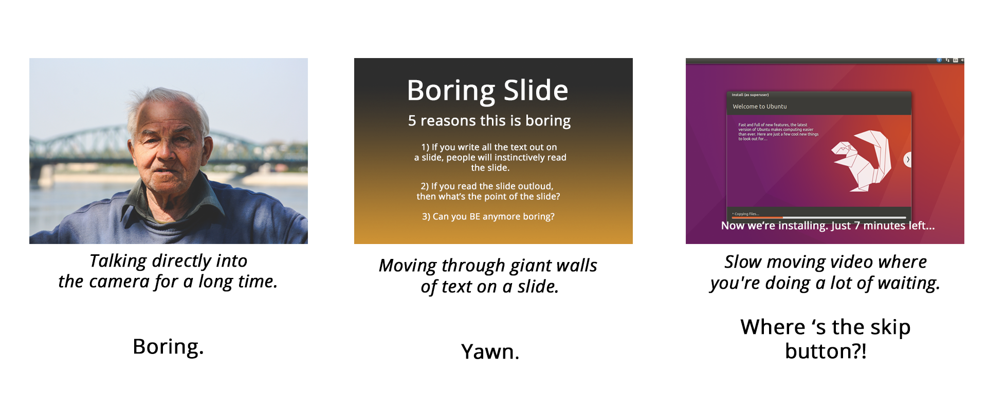
According to WIRED’S study, the average movie trailer today changes camera angle 38 times a minute. Rule of thumb: In a video, aim to change the visuals at least once every minute.
Additionally, the worst thing you can do is launch into a monotonous monolog on top of a beautiful image for too long.
2. DON’T force images into your course just for the heck of it.

When your students are in the flow of learning, the last thing they need is for a visual image to break their concentration with a jolt. They will lose focus.
Your students are going to ask: “What’s the point of showing that girl? Why is she touching her hat? What am I supposed to do with this information?”
My question for you: How exactly does this image help reinforce your idea?
Think of your online course as a nice dinner… the education you’re presenting is the main dish, and visuals are the seasoning. Your visuals are supposed to enhance the main course, not distract from it.
3. DON’T try to be cute with your art.
Are you guilty of using BBIs?
BBIs are Bad Beautiful Images. BBIs are beautiful images that don’t add value to your course. Sure, a beautiful image grabs attention. But if you already have your students’ attention, then your course images should provide clarity.
“Are you guilty of using BBIs in your online courses? ”
Tweet Me
Watch this example from our Course Builder’s Laboratory program:
In the first 30 seconds of the video, we show a bunch of beautiful images that don’t add clarity to the course message. In the last half of the video, the visuals focus on making the lesson clearer for the students.
After watching the whole video (brah-it’s 1 minute long-do it!), can you remember anything from that first half? If you’re like most people, probably not. You were too mesmerized by the pretty images that you probably stopped paying attention to the instructor.
The “Kill Your Darlings” rule of writing applies to visual images as well. No matter how much you love the images you’ve chosen, if they don’t help make your course content clearer, then you must remove them.
You’ll know if you did a bad job if students comment on your visuals and not your teaching.
What You Should Be Doing
Now that we pointed out some Don’ts, here are some Do’s that you should implement in your online course.
4. DO know where to find great art.
The internet is cluttered with ultimate guides on where to find great images for your online course. I like Buffer’s guide to stock art (the beautiful photographs) and Creativeblog’s guide to vector artwork (logos, icons, and symbols).
While free is always good especially when you’re just getting started, free stock art sites lack the wide range of visuals you may need. If your course references performing yoga on your roof, you’re not going to find it on a free site.
But on a paid stock art site like Fotolia, the keyword phrase “yoga on the roof” yields the following results:
Boom –> 790 options!
Mirasee currently uses the following image subscription services: Fotolia, Pond5, and Flaticon. There are many others available. Shop around.
If you’re new to stock art, here’s a tip: Get just the right image size you need. Don’t pay more for larger images, if you don’t need them.
For example, Mirasee courses are presented as HD videos at 1920×1080 resolution. This means:
- Great stock photo size = 2000x
- Bad stock photo size = 200x
- Overkill = 8000x
If your course is at 4k resolution, then aim for the bigger images.
Remember, it’s easier to scale down images than it is to scale up. But there’s no point in paying extra for huge images you won’t use.
5. DO learn how to make your own art.
Stock photos can only go so far.
If you need to explain how thought processes work in your course, you’re probably not going to find the appropriate visuals on a stock photo site like pexels.com.
You can either spend a lot of time verbally explaining it, or show what you mean in a quick visual, like this:
The free Coursera course on Learning How to Learn explains the thought process with the help of a simple visual.
Imagine if they instead went with a pure lecture! It would have been so confusing!
For Mirasee’s courses, we use Photoshop to create our own visual designs. This includes everything from overlaying text on images, to making graphs and charts, to modifying photos.
Photoshop is pricey, though, and has a steep learning curve. Alternatives to Photoshop include:
- If you need an all-around graphic editor, try Pixlr and Paint.net.
- If you need to make charts and graphs, look to using a platform like Plot.ly or making it out of a spreadsheet software like Google Sheets or Microsoft Excel.
- If you need to overlay text on images, Canva can help.
- If you need to make a flowchart, check out Flow.io.
- Our courses frequently show sales pages and websites to use as examples. I use web-capture.net to grab the whole website page.
Additionally, if you’re creating your own art work, you may want to learn more about composition, color theory, and UI design .
6. DO match emotions with images.
How does this image make you feel?
I bet you couldn’t help but shift your face to match the photo. We “borrow” the emotions expressed in images we see.
Comic books have been using this secret weapon for decades.
If you want to be a great storyteller through visuals, Understanding Comics by Scott McCloud is a must-read.
In this lesson in our course, The Art of Offer Craft, we explain why pitting features and benefits against each other can be outright wrong.
When you explain the technical specifications of a computer to a grandmother, she’ll be confused. But explain those same specifications to a tech nerd, and he’ll be outright excited. The emoticons reflect the emotions we’re referring to.
7. DO whatever it takes to provide clarity.
What better way to describe a fork in the road than a picture of a fork in the road?
In that context, the image makes perfect sense.
But imagine you were expressing the idea of “the easy road and the hard road.”
Then this image no longer makes sense. It doesn’t show a clear-cut “easy road” or “hard road.” They both look the same.
How do you fix it? How about adding some text to it.
You: “But Rocky, adding text on top of a photo is so gauche….”
Rocky: “It doesn’t matter.”
You’re not submitting your artwork to the Louvre.
In an online motorcycle training course, you might see something like this.
It’s not going to win any awards for best visuals. But it can save people’s lives.
Wrap-Up
Your course visuals are vital to reinforcing your teaching. With so many online courses just a mouse-click away, the courses that create change and help students evolve will rise to the top. The ones that are mere info-dumps will fade away.
Make your course the one that changes your students’ lives. Boost their learning and comprehension by using images effectively.
What’s your biggest challenge when it comes to finding and choosing visuals for your course?
Cheat Sheet: 5 Steps to Choose an Online Course Platform
Narrow your choices, clarify your needs, and find your ideal match!
about author
Rocky Kev
Rocky is passionate about helping entrepreneurs succeed through social media marketing, content marketing, and audience building. He is the technologist of the Course team at Mirasee, as well as the founder of Serious Game Devs, a marketing website for indie devs. After a long day working with technology, he relaxes with the warm glow of more technology.
Read more posts by Rocky Kev
Danielle
Rocky’s post
Hi Rocky – Thank you for this post. Irrelevant images are one of my major pet peeves as well. I call them “stationary” (like that perfumed writing paper with the pretty flowery border). An alternative that I’m getting interested in is drawing simple pictures like Dan Roam teaches. Here’s a sample: https://www.youtube.com/watch?v=PqbhFrIcVik
QUESTION:
I was wondering about image file size.
> You mentioned 2000x…but what is the optimal file size in bytes
> And what tool(s) do you recommend for compressing images? TinyPNG has been working for images under 5MB. But some images are even larger than that!
Thanks again.
Danielle
Rocky Kev
Hi Danielle! Thank you so much of the comment! I really appreciate it!
I love that — calling it stationary!
So image size —
For video, your image’s file size doesn’t matter. It’s rendering to video anyways. Something small like a logo might be 4kb (a well optimized SVG format), or 40 megs (un-optimized ai. file) — but when sent to your video editing software, it’ll flatten.
For your site, I’m no website expert – but in terms of course images, it should be a ‘fit’ for the page. For this blog post, the images are resized to about a width of 500px (which fits a browser/mobile screen), and range between 40-100 kb, as jpg files. The website optimizers out there will cringe that I say this – but I’m not too concerned about over-optimization on website images. Especially if your course site is locked behind a paywall, which doesn’t need SEO or SEM (since you don’t want your course content publically accessible in Google’s eyes.)
Did that answer your question? Let me know if I missed something!
Maurice
Great post! Clear, to the point without any unnecessary fluff. Entertaining as well. Nice one Rocky!
Rocky Kev
Thanks Maurice for the comment and feedback!
When this topic was suggested, I really spent a lot of time brainstorming funny jokes rather than actually writing. So it’s refreshing to hear that I was able to be entertaining and still provide value. 🙂
Pauline
uh oh – I’ve been guilty of using Beautifully Bad Images and didn’t even know it. Thank you so much for putting me straight! This is just the right info I needed!
Rocky Kev
Hi Pauline, thanks for the comment!
I was in the lucky position to have built 7 courses in one year. And the first 3 courses was definitely a learning experience! 🙂
In other words – learn from my mistakes! 😀
Fran Watson
I kept wondering what the pictures had to do with what you were saying in the first half. I loved what you did with the second half. You definitely made your point!!
Rocky Kev
Hi Fran – thank you!
Carol
Thank you, Rocky, for providing such great resources for people to use. I will definitely be checking them out! And I agree with Diane, the video clip with bad versus good is an excellent example of BBI!
Here’s a question for you – how much average time should we spend on finding images, creating art, etc? 5% of course creation time, 10%, 25%? It would be helpful to know if I spend way too much time on this aspect of my course.
Rocky Kev
Hi Carol – thank you for the comment!
Great question about average time. There’s two approaches I have.
1 – As the member of the course team – everyone has different roles. I’m given a script, and I populate it with visuals that will enhance the content being presented. For a HIGH PRODUCTION VALUE course — in a 10 minute lesson, that would probably take me about 10 hours of finding/building the artwork. Our Mirasee courses use a lot of art and animation to add clarity. So a 2 hour course (120 minutes == 120 hours of art development.)
2 – For my own video productions, where I do everything from writing the script, making the art, and the video editing – there’s less production value. It’s pretty QUICK AND DIRTY! It try to set myself up with about 2-3 hours to produce a 10-minute piece. i focus on putting visuals in places that provide clarity, or in places where I something to juice up the attention. I keep it within an hour because this is a black hole where you can spend hours/days making tiny changes for little gain.
Any course creator starting out, lean into the Quick and Dirty side and just focus on having a strong outcome. (A la tip #7!)
What type of course are you making Carol? I’d love to know what your angle is!
Diane
I LOVE this post! The video clip of bad visuals vs good visuals is especially helpful in understanding how it actually decreases your understanding to have unrelated visuals. And… I just wish I had all day to play with graphics now!
Rocky Kev
Thanks Diane!
It IS a black hole! You can tinker forever. It’s definitely a battle of making hard decisions, and
setting up a system like pomodoros and expectations to make sure you’re not spending hours on an art asset that disappears in seconds.