Lead Generation: 5 Ways to Optimize Your Blog
Pierre de Braux
So you’ve spent a whole bunch of time crafting content for your business blog, and though you’re getting visitors, no one seems interested enough to engage with your brand further.
Does that mean your content is bad or irrelevant?
Possibly, but unlikely.
A lot of the time, it’s because your blog simply isn’t optimized to generate leads.
Pretty much every business that has its own website is creating blog content.
Unfortunately, not all of them know how to leverage their content to generate leads for their business.
I’ve seen some really well-written articles out there and thought to myself: “Where’s the call to action? Why isn’t this blog trying to convert its readers?”
Let’s be honest.
As a business, you certainly wouldn’t be spending valuable time and money researching, creating, and promoting awesome content unless you knew the benefits would outweigh the costs involved.
So if you’re already publishing blog posts, shouldn’t you also ensure that you’re maximizing the associated benefits?
Marketing comes down to generating new leads in an attempt to convert them into customers. So if your blog is able to support your lead generation campaign, that makes it an effective marketing tool.
If blogging works for 82% of marketers who blog, it can work for you too.
Here are a few of reasons why blogs work for lead generation:
- They drive traffic to your website and make your business more visible online.
- They build authority, thought leadership, and trust for your brand.
- They connect people to your brand and help you build strong relationships with your readers.
- Blogs are replacing homepages as the primary place for businesses to engage and convert their audience.
So if you’re not happy with how many of your blog readers sign up for your mailing list, here’s how to optimize your blog to generate more business leads:
1. Optimize Content for Your Audience
Before you start writing, understand who your audience is and what topics they want to read about. Define your audience and discover where their interests lie, what problems they’re facing, and how you can provide value to them through your content.
Effective targeting is one of the most important parts of your content strategy, because if you’re trying to speak to everyone, you’ll end up speaking to no one.
You can learn about your audience simply by listening. People these days are more than happy to voice their opinions and concerns on social media, blog comments, forums, industry communities, and just about any other platform that facilitates user-generated content.
Look into what your target audience is searching for online and what keywords they’re using. This way, you’ll be able to optimize your content from the get-go. Publishing blog topics that address your audience’s intent is the first step towards creating targeted content your audience will find valuable. Your blog titles play a big part here so ensure that your copy is attractive and compelling.
Write in-depth articles that answer your readers’ questions with well-researched topics that contain quotes, statistics, and findings from industry authorities. Knowing that your content is backed up by facts will help build your credibility and earn your audience’s trust, which improves your brand’s reputation.
2. Use Effective Calls To Action

Calls to action (CTAs) vary depending on where they lead users. Whether you want to direct visitors to sign up for a newsletter, download an eBook, or get a quote, you can optimize four elements of your CTAs:
1. CTA Design
The design of your CTAs can greatly affect click-through rates, so find the right shape, color, and size that makes the CTA button distinctive without overwhelming your website design.
Color

Credit: Hubspot
Though it seems that the most prominent CTA colors are green, red, and orange, the success of a particular color differs for each case. In the above example, HubSpot tested Performable’s CTA and discovered that the red button outperformed the green button by 21%.
In another test, SAP saw a 32.5% increase in conversions simply by making their CTA orange. For both examples, colors that were more contrasting against the page performed better than the alternative because the buttons stood out more.
Shape
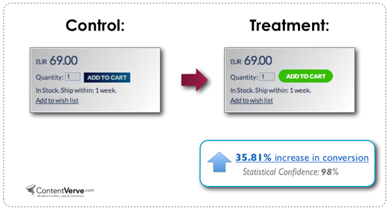
Credit: Neil Patel
With your CTA button shape, once again, there aren’t any hard and fast rules. But it should generally reflect your brand/website theme to maintain consistency. In the above image, Unbounce shows that they managed to increase conversion rates of a CTA by changing the shape and color of the button to green with rounded corners.
German UX designer Paul Olyslager states that rounded button corners are psychologically more effective for three reasons:
- They point inwards and draw attention to the content within the button.
- Humans are programmed to avoid sharp edges because they present a possible threat.
- Studies show that rounded rectangles are easier for people to see than those with sharp edges (which involve additional neuronal image tools).
Size
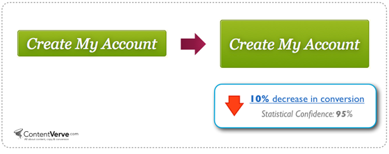
Credit: Neil Patel
When it comes to the size of your CTA button, you want to make it as big as possible without distracting users from your website content. Unbounce’s advice is to “go big but not overboard”. You’ll notice in the test above that increasing size doesn’t always lead to increased conversions. An oversized CTA button can make users feel overly pressured to convert.
Test out different design variations to discover what combinations work best at compelling users to click on them. It all depends on your website design so keep trying till you get it right.
2. CTA Copy

Credit: Neil Patel
The wording of your CTA should be direct to the point and relatively simple. Make sure to use actionable verbs that relate specifically to the next course of action so it gives readers a good idea of what to expect. Ideally, you want visitors to be able to glance over the CTA and know exactly what they’ll get by clicking on it. The above example shows how ContentVerve used clarifying words to significantly increase their clickthroughs.
“Avoid using words that create “friction” when creating your call to action. ”
Tweet Me
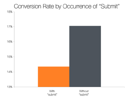
Avoid using words that create “friction”. This refers to any words that describe things people have to do, as opposed to things they actually want to do. For example, the default text “Submit” can have lower conversion rates, as Hubspot confirms in the chart below. Here’s a list of high-friction words to avoid.
Credit: Hubspot
And whenever possible, create a sense of urgency. Words like “now,” “exclusive,” or “limited” compel users to act sooner rather than later.
3. CTA Positioning
Where you position your CTA on your blog can mean the difference between catching a user’s eye, or having it go completely unnoticed. Normally, I’d recommend that you keep your CTA above the fold but that doesn’t necessarily work for every case, as you’ll notice in ContentVerve’s example below.
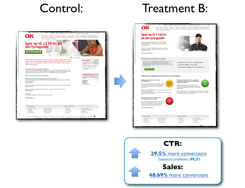
Credit: Neil Patel
Sometimes, placing your CTA on top of a page reduces the chance of users scrolling down to view the content.
Test different positions like mid-post, at the end of your post or in the side columns to see which ones convert more. You can even try using multiple CTAs positioned all over your blog, it might just help direct users more effectively. But don’t go overboard, because that can annoy and turn off your readers.
4. CTA Prevalence
Generally speaking, you should include CTAs in every one of your posts. There has to be an intention behind each article so why not tell readers exactly what you want them to do next?
Credit: Social Media Examiner
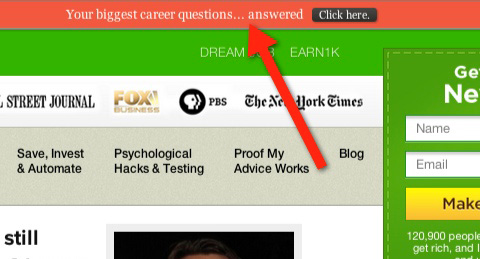
Top bar CTAs (as seen in Social Media Examiner’s example above) are a great way to display a compelling message without being too intrusive. Whereas exit-intent popups make sure that your CTA always gets shown to readers, even when they try to leave your page.
Keep in mind that you don’t want to come off as too pushy like Moneylab’s ever so slightly exaggerated blog post, so test different combinations to discover what works best.
3. Make Your Signup Forms Less Scary
Nobody likes filling in forms, whether it’s because they don’t like giving out their personal information or because they’re just lazy.
The same goes for lead capture forms on your blog. Visitors might want your offer (newsletter, quote, free trial, etc.), but an excessively demanding form may deter them from following through. That’s why you need to make sure that you’re asking for as little information as possible.
As a rule of thumb, only ask for the details you need to start building a relationship with that visitor. Most of the time, a name and an email address are all you need to begin a dialogue with them.
Keep in mind that shorter forms may increase the number of leads you get, but lead quality will be higher when visitors are willing to provide additional details about themselves and what they’re looking for. Adjust the length of your form length depending on your objectives.
Expedia eliminated one field from their lead generation form and saw a significant boost in conversions. They realized that including a “Company Name” field deterred prospects so they removed it, which resulted in a $12 million profit for the company.
You can also choose to consider having a two-step opt-in process. This involves asking your prospects to click on a link before seeing your opt-in box (form). Because of the increased level of commitment required to opt in, a two-step process can lead to higher quality leads and increased conversion rates. Although this is less intrusive, it can also reduce the overall volume of leads that your blog generates.
4. Create a Newsletter
Email newsletters create a reason for your audience to sign up. Even in the age of web browsing and social media, people still value and appreciate digital deliverables. E-newsletters help to keep your audience engaged and act as a constant reminder to keep your brand top-of-mind.
The more a customer sees and engages with your brand, the more likely they are to become leads.
Although e-newsletters have been around for quite a while now, they still provide marketers with an effective channel for nurturing leads. Make sure that you put your newsletter signup form in every possible place that makes sense on your website to maximize the chances of new signups. Permission marketing is known to be one of the most effective strategies to generate quality leads, so don’t neglect this opportunity to get subscribers.
Here are some best practices for creating a successful e-newsletter:
- Be 90% educational and 10% promotional, so you don’t come off as aggressively salesy.
- Be creative with your email subject lines to increase open rates.
- Pick a single primary call to action. Don’t detract from the ultimate goal.
- Be minimal with design and copy. Get straight to the point.
Credit: Entrepreneur.com
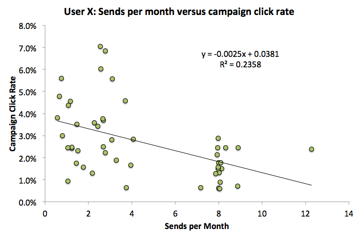
There are different optimal frequencies for sending out newsletters, so it depends on your brand and your audience. But as Entrepreneur depicts in the graph above, the sweet spot usually lies somewhere between 2 to 4 emails per month.
5. Keep Testing, Evaluating, and Evolving
There are literally hundreds of style and placement combinations that you can alter on your blog to entice your visitors to become leads. However, you don’t have to reinvent the wheel. Learn from what’s worked with similar businesses in the past. And if you ever run out of inspiration, check out what your successful competitors are doing.
Remember to stay active on your blog. It’s an ongoing process that takes time to work. Be persistent when it comes to testing different strategies. You never know when you might come across a combination of tactics that supercharges your ability to generate quality leads.
A practical way to do this would be to use Google Analytics to detect changes in visitor-to-lead conversion rates for each testing variable. Remember to only test one variable at a time so you know the exact cause behind any success or failure. You can use tools like this free Sample Size Calculator to determine an appropriate sample size for your tests.
When it comes to optimization, you should always be testing and improving. There is no one-size-fits-all strategy for blog optimization. Always track your results so you can discover what tactics work for your audience.
What are some of the more creative tactics you’ve seen brands use to generate leads through blogs? Which strategies have you tried or would like to do so in the future?
10 Email Newsletter Ideas
Use these proven newsletter ideas to jumpstart your writing!

Sonya Dudley
Excellent article! Very important topic to talk about, and I admire you putting in the time to discuss it. I shared your work with my followers and they really liked it also. Hope to be learning more from you soon!
Amar kumar
Hey Pierre,
To build an effective business blog, we not only need writing and editing skills, we also need various inbound marketing skills. We need a knack for analyzing data to understand what’s working and what’s not on our blog.
We need design resources to build our blog’s template and some basic design skills of our own to create calls-to-action for lead generation. Eventually, thanks for sharing this valuable tips with us.
With best wishes,
Amar kumar