42 Ways To Scare Off Your Customers With Bad Website Design
Tema Frank
Imagine that you wake up one morning and you realize, “Hey! That guest post that took me hours and hours to write has finally been published!” You boot up your computer and, sure enough, people are loving your post.
In fact, they’re loving it so much that they’re clicking on your link because they can’t wait to learn more about you and your products or services.
But when they arrive on your website, they see garish colors, a home page with too much stuff, and music starts playing in the background. Hastily, they click away, never to return again.
Don’t let this happen to you! You’ve worked too hard on building your business to lose prospective clients because of web usability mistakes.
Here are some of the most common bad website design traps that you may have fallen into.
First Impressions: Looks Matter
Trap #1: Creative Craziness
It might look cool, but even ad agencies lose business by getting too creative in their website designs. Your site visitors must be able to find what they are looking for quickly and easily.

In the website above, I thought that pressing the video arrow would take me to information about the company, but it just took me on a dizzying ride through their maze, with musical accompaniment.
Follow standard patterns and layouts that people expect on websites. Place your main navigation links across the top of the page, and make sure that your links are easily recognizable. And if you are going to include an arrow, be sure it leads your prospectives to a logical next step in learning how they can work with you.
Trap#2: Poor Colour Contrast
Subtle pastels may be great colours for a spa, but even a spa’s website visitors want to read the contents without straining their eyes. The biggest key to making your website easily readable is to have a lot of contrast between the color of your background, and the color of your text. That’s why you see so many black on white or white on black website designs – there’s a lot of contrast between white and black, which makes it easy to read.
Here’s a simple tool to check your colour contrast. And don’t forget: while excellent color contrast is essential, do also avoid clashing colours that strain your readers’ eyes.
Trap #3: Your Colors Don’t Match Your Brand
Your website is the visual representation of you and your personality. Therefore, the colors you choose to use in your website are actually telling your customers quite a bit about you!
You don’t want your colors to be too overwhelming (hot pink and neon orange, anyone?), because it’s too much, too soon for your brand-new prospect. On the other hand, though, you don’t want your website to feel boring or otherwise unappealing to your audience.
Choosing the right colors for your website should be about how your customers will perceive you, not what you like. This article by 99 designs is a great place to get started.
Trap #4: Not Mobile-Friendly
Your site must be easy to read on a mobile phone screen. But that doesn’t just mean shrinking the text size. A truly responsive website will display things differently so that they are easy to read and navigate on a cell phone.
Here is an example of a site that was not adapted for mobile:
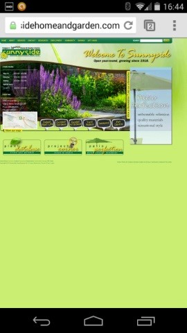
This is the actual size on my Nexus 5 phone, which is a decent-sized phone. Sadly, not only is it unreadable, there’s half a screen of wasted space!
A well-designed mobile site will adapt to a variety of screen sizes, fill up the whole screen, and be easily readable.
Trap #5: Not Tablet-Friendly
Making your website tablet-friendly is just as important as making it mobile-friendly. And yes, it is possible to make a website mobile-friendly, but not adapt it to a tablet!
That’s because smart phone screens and tablet screens are different sizes. Up until the introduction of tablets, most responsive website themes would look good on any smart phone. Now, you’ll want to chose a responsive design for your website that will look good on all kinds of mobile devices, including tablets.
Trap #6: Wasting Space “Above the Fold”
You don’t need a huge picture or banner across the top of your website. This is referred to as the area “above the fold,” which is a fancy way of saying the part of your website your visitors will see before they have to scroll down the page.
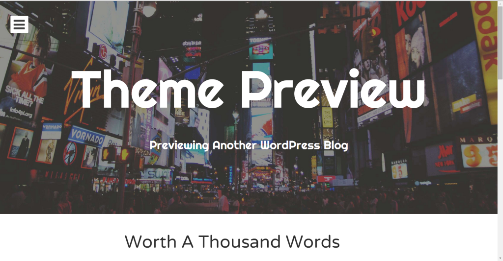
Although it looks cool to have a big picture at the top of your website, think about it from your prospective client’s point of view. They’ve arrived on your website because they have a problem, and they want you to solve it.
Make sure that what they see in that first screen tells them that they’re in the right place, and motivation to want to read more. Having a picture is good, but it should NOT take up almost the entire first screen.
Trap #7: Relying on PDF Documents
If you have a lot of information to share with your potential customers, you might be tempted to put them up as downloadable PDFS. This is bad for readability and for search engine optimization (SEO). You can have a downloadable pdf version available as an option, but make sure you convert your pdf’s to web-friendly formats, such as posting them on a page or making them into a blog post.
Trap #8: Animation
Really, folks, the days of dancing dogs on a star-spangled background are loooonnnng gone! Not only is this distracting for your customers, but if your customers are at all web savvy, they’ll know that animations are from the very early days of the web. Perception is everything online, and if your customers think you’re not up to date with the latest website trends, you may not be up to date in your area of expertise, either.
Trap #9: Sneaky Sound Attacks
If you are featuring a video on your page, don’t have the sound come on automatically. Not everyone is checking out your website in a quiet, private place. And even if they are in a private place, many people find that having videos or music automatically start playing to be very disconcerting online.
Trap #10: Don’t Flash Me!
Flash is a type of programming that was used in the early days of the internet. However, we’ve moved on from Flash in the last few years, which makes flash a bad idea for a whole bunch of reasons!

One of the best reasons not to use it is that it usually delays people getting to the content they want to read! Not all smart phones and tablets can handle flash, either, which means that your customers will be frustrated and leave your site without reading any of your great content.
Trap #11: To Click or Not To Click?
If your website visitor has to guess at what to click on to move around your site, the odds are really high that they’ll give up altogether. Make it obvious what is clickable; and make things people expect to be clickable (for example, images that look like buttons) actually be clickable.
Trap #12: Having to Click in Just the Right Spot
Whenever you include a clickable link, make sure that the space around that link is also clickable. Don’t just make the arrow at the end of the words clickable – include the words themselves, and a bit of white space around them. Or if they are in a box, the whole box should be clickable.
Trap #13: Don’t make me squint!
There’s nothing worse than having a font too small to read. Make sure your fonts (text sizes) are big enough to be easy on even middle-aged eyes.
While font sizes will vary depending on what font family you’re using, a good rule of thumb is make sure that your standard text size is between 12 and 16 points in height.
Trap #14: Too Many Pages Per Piece of Content
The main purpose of your website is to share your authority and expertise. To do that, you probably have several long pieces of content. It can be tempting to break up those long pieces of content into smaller pieces, which can be accessed by clicking on a link at the bottom of the previous section.
It’s tempting, but don’t do it. Your website visitors are looking for the fastest way to the information they need. And as silly as it sounds, it’s also really frustrating to have to click a link for only a paragraph of content.
Trap #15: Long, Dense Paragraphs
As a student in school, you were probably taught that a paragraph is at least 5 – 7 sentences. That’s true in print, but on your website, your sentences are going to take up a lot more space than in a textbook. If your paragraphs are too long, your visitor’s eyes will register the entire paragraph as a big, black, incomprehensible chunk of text, and their eyes will automatically skim down to the next paragraph.
Make your pages easy to scan quickly. Use headers to indicate when you’ve changed ideas. Use bullet points to emphasize a list, and white space between paragraphs to give your visitor’s eyes a chance to rest before going on to the next paragrah.
Trap #16: Inconsistency
In some ways, inviting a website visitor onto your website is like inviting a visitor into your home for the first time. Your visitor is trying to get a sense of who you are and what you’re about, and every visual element on your website is part of that first impression.
Since you are working to gain their trust, the last thing you want to do is throw something inconsistent onto your website. If your clickable links are blue on page A, they should also be blue on page B.
Keep a consistent look throughout your site. If you have to take people off the site (e.g. to pay), warn them of what’s happening before they leave your site.
Trap #17: Too Self-Centered
Being too focused on yourself instead of on your visitors is a common trap, especially on your homepage. In some ways, it’s understandable: your visitors have come to your website to learn more about you.
But in fact, that’s not true. Your visitors have come to your website because they have a problem, and you can solve that problem. How you can solve the problem needs to be very clear the moment they arrive on your website. If there’s no clear benefit for them to explore your site, they’ll move on to a site that does demonstrate a clear reader benefit.
Trap #18: Basic Spelling or Grammar Errors
Publishing on the web isn’t as regulated as publishing a best-selling novel or a textbook. Nevertheless, having a basic spelling or grammar mistake on your website is definitely not going to win your visitor’s admiration.
Remember that they’re on your website to find out how you can help them. Even though it’s a small detail, having a spelling or grammar error says to your visitors that you don’t produce quality work.
Trap #19: Displaying Pop-ups at the Wrong Time
Pop-up windows are a new window that opens on your visitor’s screen when they’ve been on your site for a specified amount of time. You’ve probably seen them used to invite visitors to sign up for an email list in exchange for a free gift.
Done right, these sorts of pop-ups can be very effective. However, if your pop-up appears before your reader has had time to read the content that attracted them in the first place, your visitors are much more likely to withhold their email address.
If you do include a pop-up on your website, be sure that there’s an option to close the window. Most pop-ups come with this option, but definitely make sure yours does. Otherwise, your visitors won’t be able to keep reading your site.
Trap #20: Putting the Wrong Content Behind an Email Opt-In
Putting some of your content – like a particularly valuable ebook, infographic, or mini-video course – on a page where only people who have opted in can access it is a great idea. It encourages people to sign up for your email list.
But, don’t go opt-in crazy and start blocking off large parts of your site. Your primary goal is to give your visitors as many resources as possible, to demonstrate your expertise and get a sense of whether you are the right person to solve their problem.
Trap #21: Allowing Comments on Pages
This is a particularly common mistake with WordPress websites. By default, WordPress allows your visitors to comment on every page, and every blog post, that you put up on your website. There is no “do not allow comments on pages” setting, which means that every time you create a new page on your WordPress website, you’ll need to check the “do not allow comments” setting for that page.
Allowing comments on your WordPress pages makes you look, quite frankly, like someone who doesn’t know the first thing about the web. Comments are only acceptable on blog posts, never on pages.
Trap #22: Embarrassingly Small Social/Subscriber Stats
Many big websites display their number of social media followers or the number of subscribers on their email list in their sidebar. You might, therefore, be tempted to do the same.
Don’t.
The reason big websites can get away with displaying these numbers is because the numbers are impressive. Your social media following or subscriber numbers are a lot lower, probably so much lower that that won’t impress your visitors. If your numbers won’t impress your visitors, then don’t include them. They won’t provide the social proof the way they do for big websites.
Trap #23: Using Ads
This is also an old-school website design trap, and you should avoid it at all costs. Do not put any kind of advertisement on your site. The whole purpose of your website is to gain your visitor’s trust. How trustworthy do you look when you’re advertising products you’ve never used or that aren’t related to your site in any way?
Your Website Content
Trap #24: Too Generic
Chances are that you’re not the only website offering your product, coaching service, or online class. So if you settle for a generic description of who you are and what you do, your website visitors won’t be very motivated to work with you.
Take a look at this example:
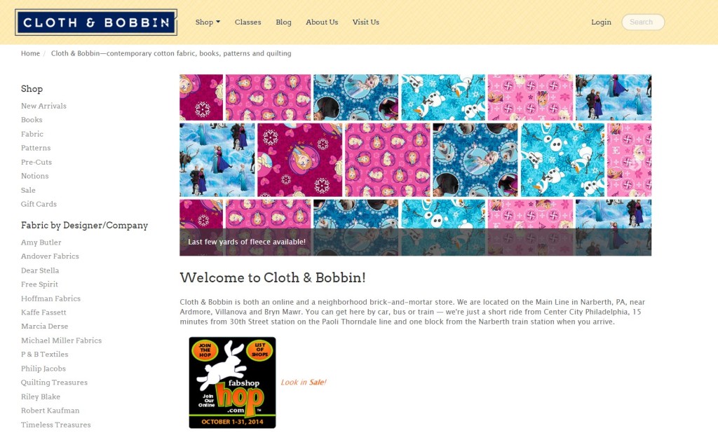
There’s nothing about this website that screams “Yes! You’ve come to the right place. I can solve all your sewing and fabric problems!” to its visitors. In other words, it’s too generic.
Rather than focusing on where they are located (important information, for sure!), their welcome content might want to talk about how their staff are all sewers with expertise to help you find exactly the right cloth for your project. Or how they carry fabrics that you can’t get anywhere else in the US. Or whatever else makes them stand out from their competitors.
What’s your unique selling proposition (USP)? Why should your website visitors buy from you instead of somebody else? There shouldn’t be anything generic about that!
Trap #25: Poor Navigation
Navigation is how your visitors will move around your site, so it’s important that it’s easy for your visitors to tell where to go to find what they’re looking for on your site. Test out what is logical to your users, first by going through your website as a first-time visitor, and then asking a couple of friends or family members to do the same.
Good website usability also means not using cutesy navigation link names. Don’t call your About Us page “The Fab Five” – even if there are five of you! It should be clear from the links in your navigation menu exactly what your visitors will find on those pages.
Trap #26: Ignoring Standard Reading Patterns
In languages that are read from left to right, top to bottom, put the most important info in the top left. Your website visitor’s eyes scan your page in a capital F pattern, so leverage that to show the things you most want them to notice.
Trap #27: Hidden Contact Info
Many websites make it very difficult to find any kind of contact information. Don’t make that mistake with your website. The whole point of having a website is for your potential clients to find out more about you. Of course you want to make it easy for them to get in touch with you!
You should have a prominent contact link at the top of every page. And if you are more likely to make a sale with some phone contact first, put the darn phone number (toll-free) on every page in big numbers.
Trap #28: Ignoring Social Media on Your Blog Posts
You’ve spent a lot of time and effort to create the content on your website – especially your blog posts. You want to make it as easy as possible for your website visitors to share that great content on social media!
Include social sharing buttons on your blog posts, so that your readers can share your post on Twitter, Facebook, LinkedIn, etc. It doesn’t matter if you have an account on these platforms or not – the point is for your visitors to share your content through *their* social media account.
Trap #29: Pretending Price Doesn’t Matter
Price always matters, especially to people who are new to you, or to your area of expertise. Even if you can’t bring yourself to put in exact prices, give them a range and explain what affects the pricing. If they aren’t in your ballpark, all you lose by revealing your pricing is wasted sales time with someone who was never really a prospect anyway.
Trap #30: Not Answering Questions To Encourage Them to Contact You
Encouraging your potential clients to contact you is a good thing. But encouraging them to do so by withholding information that they *want* to see on your website is not the way to go about it. It will annoy your potential clients, and they may even think you’re dishonest for not including that information up front.
Answer all the questions you can think of. Not only will that help with your search engine rankings and save you time on the phone, it will make prospects more likely to call you, not less, because they’ll admire your expertise and willingness to share.
Trap #31: Thinking Anonymity Makes You Seem Big and Corporate
Because many of us have grown up with big businesses, it’s easy to slip into talking about your business, products, and services in the third person. This is a perfect example:
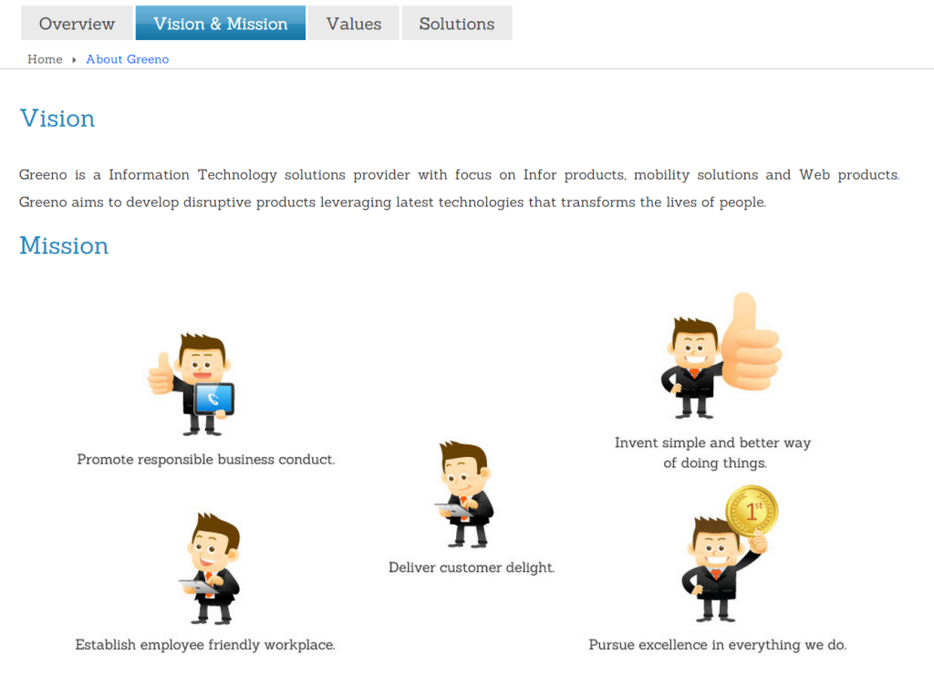
But nobody is fooled – it’s fairly obvious to your website visitors that you aren’t big and corporate, and pretending that you are will send mixed signals to your visitors.
Instead of talking about yourself like a corporate entity, Show who’s behind the site. Put up pictures of the real people who work in your company. This builds trust, and emphasizes that you aren’t a big, boring, corporate company.
Trap #32: Overusing “click here”
When people were first building websites, when they wanted to include a link to another page, they simply wrote “click here” and made that phrase a clickable link.
However, we’ve moved past those early days, and “click here” doesn’t give your reader any indication of what’s there. It is better for scanability, SEO and people using screen reading software if your links are descriptive. Something like “download your free report” or “discover the 5 ways to improve your night’s sleep” is much more enticing for your visitors.
Trap #33: Lack of Clarity on Your Home Page
Your website visitors have come to your website because they’re looking for something specific: a problem you can solve, or a delight they want you to create for them. If it’s not immediately obvious that you can provide what they’re looking for, your visitors will move on to another website.
Make it clear to visitors who arrive on your homepage exactly how you can help them solve their problems. For example, the very first part of the Firepole Marketing website says “Design Your Business, Build Exposure, and Make Sales.” It’s clear and concise – if you’re looking for help with one of those three things, you’re in the right place.
Trap #34: Overusing Images
When you’re designing your website content, it’s tempting to go image-crazy. After all, images speak louder than words, right?
The truth is, a big part of how visitors find your website is through search engines. And search engines can’t read words or content that’s in an image. So if you have too much of your content in image form, you’ve hidden all that information from the search engines.
Use images wisely. You should absolutely include them on your website, but they shouldn’t include much of the content of your website.
Converting Your Visitors Into Leads or Paying Customers
Trap #35: Lacking Call to Action Buttons
You know your website inside and out – but your visitor doesn’t. Make it clear what your visitor is supposed to do next on every page of your website. Is there a blog post they should read next? Maybe you’re giving away a free resource that your visitor really needs. Or maybe they should leave a comment or email you a question.
Whatever you want them to do next, be loud and proud. Let people know what you want them to do and how to do it. Don’t hide these directions in the text of your page. Make sure your calls to action stand out by using a distinctive button or graphic, like a schedule appointment button that directs visitors to take immediate action.
Trap #36: Overwhelming Visitors With Choices
When it comes to giving your visitors choices about where to go next, you might think that the more choices you give them, the better. After all, people like having choices. Right?
Wrong. The more choices you give people, the more they have to think and analyze before making a decision. This often means that your visitors will become paralyzed with indecision, and take no action at all!
Always aim for no more than three options. And it’s perfectly ok to give them one or two options, especially if it’s directions on where to go next or what to do. Remember that you’re the guide – it’s your job to point your visitors where they need to go, and not confuse them along the way.
Trap #37: Asking For Too Much Information
Whenever you put up a free gift in exchange for people’s email address, it’s very tempting to ask for a lot of information.
Don’t.
Remember that these are the early days of your relationship – your potential customer is still sizing you up, and asking them for a lot of information is likely to scare them off. Ask for as little as possible. Every question you add loses you prospects.
Trap #38: Hiding Shipping Information
If your business involves shipping a physical good, give your visitors your shipping information and prices before they start to order. And if you don’t ship outside the U.S. (or whatever country you’re located in), say so before they’ve wasted their time filling in your forms.
Trap #39: Premature Registration
When it comes to purchasing your product or service, don’t make your potential customers register or create an account before they place an order. Instead, let them place the order and then, at the end, ask if they’d like you to save their information to improve their experience the next time they visit your site.
Trap #40: Forcing Use of Preferred Formatting
Don’t be fussy about things like spaces or dashes when people input a phone or credit card number. Have your order form or opt-in form programmed to accept the info with or without the dashes and spaces.
If you absolutely have to have the information input in a certain format, provide an example on the form so that your visitors know exactly how to enter their information.
Trap #41: Playing “Spot the Error” on Your Order Form
If your prospective customer has made an error on your form, make it obvious which field has an error, and how to correct it. The longer your potential customer has to go looking for the error, the more likely they are to give up altogether and leave without ever completing their purchase.
Trap #42: No Progress Bar in Multi-Step Process
In a multi-step process, like applying for insurance or answering a long survey, let people know where they are, and give them some estimate of how much more they’ve got to do.
The progress bar at the top of this sample form is a perfect example:
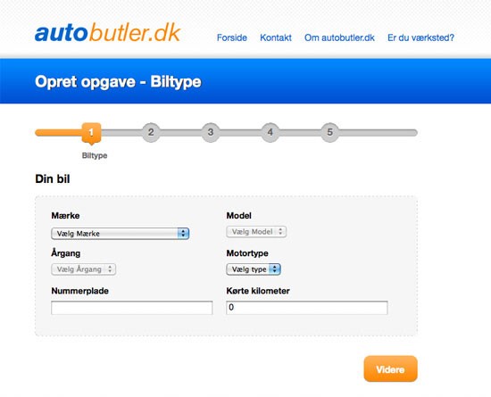
If you don’t let your potential customers know where they are and how long it will take to finish, they will start to feel as though they’ve enrolled in an endless task, and are much more likely to quit before completing the process.
Trap #43: Not Enabling Auto-Save
If your form takes more than a minute or two to fill out, make sure to auto save whatever they’ve entered as they move through your forms. That way, if the form times out or they suddenly lose their internet connection, they won’t have to start over.
Trap #44: Making Usernames and Password Rules Too Complex
If you’re asking your visitors or customers to create a username and password, make it simple to do so. Use email addresses for usernames. If the password is system-generated, say so.
If they have the option of creating a password, do not make it too complicated. This form, for example, has way too many rules about what can’t go into a password:
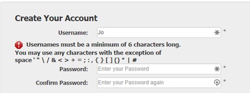
Once they’ve created their username and password, be sure to send the username and password hint to them in an email. But do not send the password itself, because email is not secure. And when they return to your site, say “Enter the e-mail address you signed up with”, not “Enter username.”
Give Your Website the Best Chance of Success
We’ve covered a lot of bad website design traps in this post, from first impressions to your website content and conversions. If you found one or more mistakes on your own website, that’s ok. Don’t dwell on it – just fix it and move on.
That way, the next time you publish a popular guest post, your website will give you the best possible chance of turning your new visitors into leads and potential clients.
What website usability mistakes drive you crazy?
These aren’t the only places people go wrong with website usability. Share your usability pet-peeves in the comments below. C’mon — get it off your chest!
Want examples of all this mistakes and more ideas about how to fix them? Grab your copy of “85 Tips for a Winning Website: Make Your Website User-Friendly to Win More Sales.”
saurabh@sngits.com
Great list and so well explained. Thanks!
Regarding the WordPress setting for no comments on pages, this option does not seem to be available on sites (like mine) created via wordpress.com. I know I need to set up a wordpress.org site soon, so I will look out for that option.
Tema Frank
Glad you liked it! Yes, the WordPress.com version is much more limited than the .org.
newsletters@saloff.com
Why is it that this page can’t be printed?
Cathy Mcauley
Fantastic check list! just when you think you’ve got it right you realise that your just kidding yourself. I don’t agree with everything you’ve said but unfortunately the majority of what you’ve said makes so much sense so its back to the drawing board!!
Tema
Thanks Cathy. Out of interest, which ones do you not agree with?
Daryl
Thanks for the tips Tema. Off to take those pesky comment forms off my other pages right now!
Marta Stelmaszak
I definitely agree with all of the points, but I think Trap 17 is one of the most dangerous ones – as even the most knowledgeable people could get trapped in it when designing a website 🙂
Tema Frank
Agreed, Marta. Another reason why it is always a good idea to have some outsiders test your website!
Sebastian Gheorghiu
Really nice list of what not to do. It is all K.I.S.S – “Keep It Simple Stupid”. I hate it when my clients request for something I know will hurt their website. This list I will be using for the near future. Website design is pinnacle to your visitors because image is everything. Thank you so much for sharing this post with the community.
Tema Frank
Thanks for the kind comments Sebastian!
Aurelie Chazal
Great list. I’ve bookmarked it and will come back to it later when we redesign our homepage.
“Trap #9: Sneaky Sound Attacks” This made me laugh out loud. I hate it when I open few tabs and all the sudden am attacked by the sound of a video on autoplay.
One of my biggest pet peeves lately is the “Breaking-up content” part. I hate when those websites with listicles make you change the page to see each item on the list. 1) This is not mobile friendly at all. 2) It takes all the “fun” out of the experience and let’s be honest that’s the only purpose most of these lists serve.
Thanks for this thorough list.
Tema Frank
Aurelie, I hate those too! That one is dealt with on page 22 of the free ebook mentioned at the end of this article.
gary969
As usual, Firepole Marketing provides more value than people expect. I refer to the title to this post which states “42 Ways…” will be shared. Of course, 44 ways are actually shared and the content within them is outstanding. Great job to you as well, Tema.
Tema Frank
Haha, Gary969! Good catch! And to think that I have an MBA. You’d think I’d be able to count!
Neale
I wouldn’t place too much faith in the Colour Contrast tool in point #2. I entered Firepole Marketing’s website in the Colour Contrast tool and it came up with at least 100 failures on each of three criteria. For me, Firepole Marketing’s website appear to have good style, layout, presentation, colour and a clean appearance. Perhaps there is a marketing angle to the Colour Contrast tool that I haven’t picked up on yet.
Tema Frank
Interesting, Neale. It may have been picking up on things like the grey logos and dates, which lack contrast.
It is certainly challenging to design a site that meets all the criteria and still looks appealing. But it is worth trying, and making sure that all the important bits are readable.
Terrence
I can resonate with #6 and #13. I shouldn’t have to start by scrollinig. And #13: If I have to squint to read your stuff — post or static page — I bounce.
Tema Frank
Terrence, a few years ago my company did a usability study for a government website where we found that the people who complained most about the font size were aged 40 – 55. In other words, they were starting to have “middle-aged” vision, but hadn’t yet given up and got bifocals!
Marylyn
Great list and so well explained. Thanks!
Regarding the WordPress setting for no comments on pages, this option does not seem to be available on sites (like mine) created via wordpress.com. I know I need to set up a wordpress.org site soon, so I will look out for that option.
Tema Frank
Glad you found it useful, Marylyn. Yes, WordPress.org does allow for more flexibility than the .com. But it does have a learning curve. Good luck!
Mary Collette Rogers
Great article–it all makes perfect sense, but it’s good to see it written out and clarified. I’ll be using this as I design my site.
Tema Frank
Good luck with your site design, Mary Collette! You might also want to check out the ebook mentioned at the end of the article, if you haven’t already. There are more ideas in there.
Penny Watkins-Zdrojewski
Thank you very much for the extremely helpful tips! Yes, I am making several of these errors on my site, and will change things ASAP.
One pet peeve that I didn’t see listed here (or missed?) is pop-ups. If I’m reading content and a pop-up appears, covering part or all of the content, it makes me really frustrated, and more likely to leave the site. If the poop-up (intentional misspelling) screams, “Buy My Stuff!”, the credibility goes way down, and I’m almost certain to run screaming.
Thank you for pointing us all in the right direction.
Tema Frank
Thanks for your thoughts Penny.
I struggle with the pop-ups issue. I find them annoying, especially when they appear before you’ve even had a chance to read the content you went to the site for. On the other hand, they really do work well.
The compromise I recommend is to set them so they don’t appear until the person has done one of the following:
– been on the site for a certain length of time (e.g. 30 seconds minimum)
– is clicking to go to a 2nd or 3rd page
– has scrolled at least 2/3 of the way down the page
– is leaving the site. (Not sure why we don’t see more of that. A few years ago it wasn’t technically feasible but now I think it is.)
Tema Frank
Thanks for the feedback Penny.
I have mixed feelings about pop-ups. I also find it annoying. On the other hand, it works really well to grow your subscriber list.
The compromise I suggest is to wait until the person has done one of the following before having the pop-up appear:
– Been on the site for a certain length of time (at least 30 seconds)
– Clicked over to a 2nd page (or 3rd)
– Scrolled at least 2/3 of the way down the page
– When they are leaving the site. (This is an ideal option, I think. A few years ago it wasn’t technically feasible, but I think now it is.)
Cathy Goodwin
I totally resonate with #29. Every so often I need to refer copywriting clients to web designers. When I see a potentially interesting designer, I will send a query about price range. At this point, that’s all I need to know. My clients will start with a price range. If she or he is in my range, I will probe further.
It’s really annoying to get a response, “Let’s set up a call to talk about your clients.”
I don’t want a call! I want a price! In fact, one designer talked herself off my list when I gave in (she was recommended by a friend) because she didn’t know some things she should have (I’m a closet geek with HTML/CSS).
On the other hand, #9 is controversial. At least one super-guru insists that videos be on autoplay because otherwise nobody listens. I suspect this one varies by market and by sender. If they know and love you, they won’t mind. It’s worth testing.
I’d never use autoplay for my career site. They’re all listening on computers in their cubicles!
Would love to hear some discussion on these ideas.
Tema Frank
Thanks for your comments, Cathy.
I think Facebook has the right approach to the video thing right now: you can see it moving, but sound doesn’t come on unless and until you click. It is hard to ignore moving images on a page, but at least it doesn’t risk upsetting the folks around you.
Paul
Great list and I see nearly all of these on a regular basis. An awesome reminder as to how easy it is to fall into these traps. I’m off to check my website right now…
However, the advice in #44 can lead to trouble. Please never, ever, ever (is that enough ever’s?) send a password via email. Email is just not a secure medium.
Sending a password in an email could also affect your credibility in the eyes of your customers which is the last thing you want at the beginning of a relationship.
Keep up the great work.
Cheers, Paul
Tema Frank
Thanks for the comments Paul.
Yikes! The word NOT got omitted in point 44! I’ll see if we can get it fixed in the post.