A Complete Recipe For Creating Compelling Calls To Action
Sanket Patel
Are you planning to increase your readership? Looking to increase the number of downloads for your latest how-to-guide or a newly launched app? Sometimes we tend to overlook the obvious. It’s right over there and it’s the visible, yet hidden secret for your success.
It’s your call to action button.
Now, before you start rolling your eyes at how boring “call to action button” sounds, let me point out what you already know: the call to action (CTA) buttons on your site’s landing pages play an imperative role in converting visitors into potential leads. Your landing pages probably already have a place to sign up for your newsletter, or download goodies, or take any number of other actions.
However, that’s not where the content marketer stops working.
An effective CTA also forms a part of the content marketing process. And trust me – it’s easy to spend hours, if not days, crafting the best CTA for a particular landing page or campaign.
CTAs work like a cherry on the cake, where cake is the whole content that informs the reader and the CTA is the cherry that grabs the eye-balls and propels the readers to take action.
Why Dedicate Time Just For a Button?
An effective call to action actually helps you convert website visitors and blog readers into email subscribers who are interested in hearing more about what you do. These buttons help create an impact with powerful message, thus getting more visitors into your conversion funnel.
In fact, many large organizations dedicate as much time to their CTAs as they do to any other web page element.
Here are four great reasons to devote quality time to your calls to action.
Guides Your Visitors
An effective call to action is always successful in guiding your visitor towards what they need to do next. A CTA is surrounded by helpful information that tells the customer what to expect next, and how to get there. In essence, it acts as a road sign to navigate from one part of your website to the next.
Generates Interest
Raising curiosity is an old trick in the marketing world, and it continues to work very well today. A simple button or a link could generate a pressing interest in your prospect’s mind to know what is in store for them on the other side of the button.
Boosts Conversion
This is, of course, the biggest reason you’ve probably heard of a CTA. The motive here is to gain as many leads as possible by enticing them to click on the button. Typically, you give something back to your new prospect when they click on your CTA. However, CTAs aren’t only for new prospects – often the people clicking on your CTA will be interested prospects who are ready to explore the next stage of your conversion process.
Makes Your Page Attractive
A colorful button or link backed by impactful text will make your page the sort of eye-catching design that grabs the visitors’ attention for a long time. A pleasing page will help you move more of your website visitors towards taking the action you want them to take.
Types Of CTA’s
As you go about the internet, you will start to notice all kinds of CTAs. For the sake of brevity, I’ve only described the six most commonly used ones here.
CTAs on Your Content
It is vital to have a CTA at the bottom of your blog post – or any other wonderful piece of content that you’ve created. The CTA guides your audience to take action after they consume your content. Based on where the prospects are, your CTA’s will be different at different stages of your website. The CTAs for visitors, leads and customers will vary on the different pages meant specifically for each of them.
Social Media CTAs
The goal of a social media CTA is simple: to encourage your audience to connect with you through social media. Social media CTAs can be as simple as having a “follow me on Facebook” section of your sidebar, or it could be a bit more complex, like adding social sharing buttons to your blog posts. The key for this popular type of CTA is to make it easy to use, so that your users will want to connect with you on your social network of choice.
Subscription CTAs
If your website visitors are visiting your blog, chances are they’re interested in reading your content.. If so, they would probably also be interested in subscribing to your blog posts so that they can receive them by email. If you are looking to promote your business through your blog and want to increase the blog subscriber base, make the CTA to join your email list as clear and attractive as possible.
Download CTAs
There is nothing as alluring as a freebie! If it’s something your customers really want, they’ll be more than pleased to hit the download button and fill out the form to get the latest how-to-guide, PDF, or video that will educate them and solve their pain points. Additionally, offering tools like PDF to Word converters can make your content more accessible and user-friendly. Again, highlight the main benefit – solving their pain paint – through the CTA to capture their attention.
Sliding CTA’s
Sliding calls to action are usually a small button that stays on your visitor’s screen no matter how far up or down they scroll on a particular page or blog post. These CTAS are not disturbing, and their primary benefit is that your readers don’t have to go to the bottom of the page to hit the button. They could do so while going through the content.
CTA’s On Sidebar
Unfortunately, sidebars aren’t a great place to put your CTAs. Not if you expect people to sign up for a free download or take some other action. However, CTAs could be inserted in the sidebar to help in driving the company goals. For example, if a your goal was to build up your Facebook fan page, you might place a call to action to “like” your Facebook page in your sidebar. You might also use a call to action to direct your website visitors to your most popular blog posts, or to a great piece of free content.
How To Create Compelling CTA’s
Now that we’ve covered what CTAs are, and why they’re important, let’s talk about how to create compelling CTAs that will actually move your website visitors to take an action.
There are several factors that go into a successful CTA, so we’ll look at each one individually.
Your CTA Must Make Sense
You have already done a lot of har-work with your online promotion efforts to get the visitors to your webpage. Now, you simply couldn’t afford to let them go back to the search engines and go for your competitors!
Make sure that you CTA makes sense – it should look good, be easily visible, and the text should be easy to read and – most importantly – easy to understand. Your valuable visitors required a lot of work before they arrived on your website, and they could be gone in absolutely no time if you are not able to deliver your message effectively. Demonstrate your authority and capture their attention with meaningful buttons and text so that they don’t feel the need to go elsewhere.
Don’t make the CTA complex. Keep it short and to the point. A great CTA is one that is short and sweet, and is able to deliver the message and the benefits effectively so that the visitors are transformed into leads and customers.
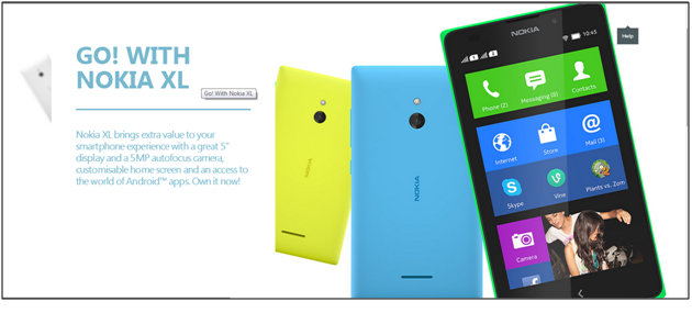
This is a good example of an effective CTA from Nokia’s website:
 The whole text block is a CTA and just pointing the cursor will highlight the text. The key features are explained with a clear message – all a visitor has to do now is click on the CTA to get their new phone!
Words that provoke action, such as “Own it Now” in this example, directly tells the visitor what to do and expect next, without fooling around. Some more examples of action provoking words that could be used in CTAs are “Visit Us”, “Sign Up”, “Register”, and more. Make the whole process quick by letting the customers know what they need to do.
Invite Your Readers to Take Action
The first question that will come to your prospect’s mind when they land on your page is what’s in it for me? If they don’t find a reason to click on your CTA, they will simply scan through your content and move on. This is not what you want. Remember, the whole point of using CTAs is to boost conversions. Create a sense of urgency- make them think that they are going to lose on something valuable if they don’t click on the CTA. Give your audience the most wonderful user experience and let them participate.
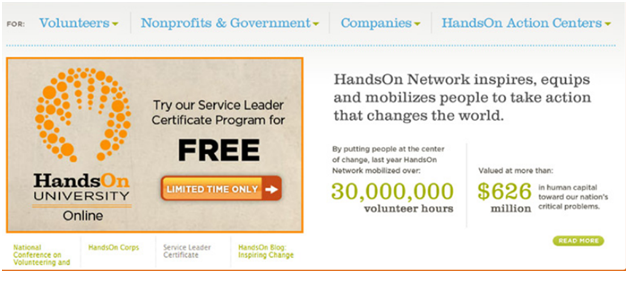
Take a look at this screenshot from HandsOn University Online.

This is a fine example on how you could interact with the audience and add value to CTAs. By simply mentioning “Limited Time Only”, it creates a sense of urgency and the fear of loss, making the visitors click on the button so as to not to let the offer slip away. The contrasting color of the button captures the audience’s attention and the description communicates the key features well.
Be as precise as possible in explaining the benefits of your CTA. Do not use too many words as it will make the CTA less understandable. It has to be placed at the right place so that the visitors are able to notice it while surfing through the content of your webpage. Don’t play with the size and text. Keep them as simple and possible, with colors that contrast with the actual colors on the box or the webpage to gain attention.
Reaction Of Your Audience
With a CTA, you are actually looking to gain the audience’s attention. For this reason, it is vital to highlight the main features of the things that the audience will get by clicking on the CTA. They should know that here is something that will relieve their pain points, or that they will get some information they had been looking for. It is important to know and use these tactics in order to provide the information in the most lucid manner. Even though you have a great resource to offer to your audience that will generate a lot of leads, it will all be in vain if your CTA is not correct.
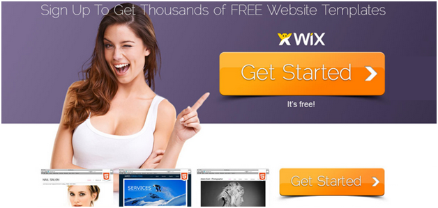
I came across a fine example for this on wix.com, a website that that offered thousands of free website templates.

This particular offer is enough to get the audience on their feet and they will at once respond to the CTA button given below it.
Test The Best Performer
Don’t stop at just one CTA that you have created! If the CTA that you have created has been able to achieve success, there are chances that a better CTA will fetch even more leads and even more customers.
It is highly recommended that you keep on tweaking the copy, color, design, size, placement until you have a CTA that is better than the rest of them.
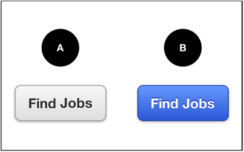
All successful design houses have started to implement the A/B testing technique so that they can hone in on the very best CTAs to grab customer attention.

In the example above, the colors are different for the same CTA. Does it matter if the button is white or blue? The only way to find out if one works better than the other is to test out the conversions for both!
Remember you need to present something on your website to your audience to get them hooked. They will not know what to do until they are able to locate the CTA.
Conquer Hearts With Great Information
Content is something that will provide value for your CTA. Content describes the benefits of working with you, or reading your website, and answers the “what’s in it for me?” question of your visitor. Content helps make your message clear. In other words, your content is a shield for your CTA.
Be as clear and as specific as possible when creating the content that supports your CTA. Any complexity will result in lower responses rate for your CTA. The content should not overpower the CTA and should justify the existence of it.
Having said that, make sure you know what your audience wants. They click on the search results to reach your page because of a promise that was given on the search engines. Make sure that the promise is fulfilled and that the audience gets their desired content.
Lucrative
As mentioned in the above point, never try to play with your audience’s needs. They want to discover something very useful – a solution, a way to move forward, an important insight. That’s the reason they went to the search engines in the first place! Now, when they click through to get to your site, make sure that you deliver what has been promised in the title of the search engine results and also in the webpage copy.
Your CTA will be as good as dead when they don’t see what they want on your webpage.
End With Boosted Conversion Rates
When you were designing your CTA, you had a goal in mind. In order to achieve that goal, you decided to create a compelling CTA and hopefully, you didn’t thrust your goal on your audience. Instead, you selected the best copy to go with your CTA that will get your website visitors moving and responding.
Now, it’s time to measure the effectiveness of the CTA. Keep a track of the following vital metrics to know how successful your CTA has been.
- Page Views
- Click-through-rate (CTR)
- Bounce Rates
- Conversion Rates
Action Step: Implement What You’ve Learned
Reading about the best practices to create effective CTAs is not enough. CTAs are crucial to connect the two most critical elements of your lead generation process – incoming traffic and opportunities for converting them into email subscribers or other types of leads. Go to your landing page now and scrutinize your calls-to-action. Do they merely form a part of the design? The ideas given here will help in coming up with new ideas for new buttons.
Do you have some more ideas on creating compelling calls to action? Do let me know in the comments below.
Dr Rie Natalenko
I have been very surprised by split testing CTA buttons. I often guess wrongly which will be most effective. Thank you for this article!
Sanket Patel
Rie, Thanks for sharing your feedback 🙂
Daryl
Great, informative article Sanket.
This may sound like a silly question to ask but – you mention specifically that CTA’s on blog posts should be on the middle of the page. Is there any use in including 1-2 other CTA’s in other parts of a blog post as well? Such as the beginning/middle, as long as the CTA is presented in a relevant and non-disruptive manner?
Sanket Patel
Glad you like the post Daryl.
CTA is crucial factor in each content, you may put 1-2 more CTA in your blog but make sure it sounds relevant. You may use feature box for getting subscribers, or giveaway stuffs might be helpful.
I hope this helps!
lita.doolan
Thanks Sanket for these great points to remember. When designing simple landing pages I now have a clearer idea about what will make a good opt- in button. Not all templates make the button clearly visible and your post shows the importance of holding out for this. I can also see the benefit of testing different designs to find the best option. I am currently trying two different options and I think comparing the results will be worth it in the long run!
Lita
Sanket Patel
Lita, glad you found it helpful 🙂