Color Psychology: How to Use Color in Marketing and Branding
Maja Strus-Vatovec
Color affects humans in automatic, often subconscious ways. And yet many marketers take it for granted.
Color is the first thing people see and it leaves a lasting impression.
It can hurt or hinder your marketing efforts. Used well, it can give your business an edge over the competition.
How well do you understand and use color psychology?
Color Matters
Research shows that color has a powerful impact on the human brain. It plays a pivotal role in all our visual experiences.
Researchers have found that consumers place visual appearance and color above other factors when it comes to purchasing decisions.
According to this infographic, 85% of consumers base buying decisions on color. When it comes to advertising, for example, full-color ads in magazines get recognized 26% more often than plain black-and-white ads.
A study titled “Impact of Color on Marketing” has revealed that up to 90% of snap judgments made about products can be based on color alone. The study also found that initial judgment about a product is usually made within 90 seconds of seeing the product, and up to 90% of that judgment is based on color.
Interesting, right?
The idea that different colors trigger different emotions in people and influence their buying behavior changed how businesses use color in branding and marketing. The Maryland study has found that color or a combination of colors can increase brand recognition by 80% when chosen carefully.
Many companies make a mistake when it comes to color and branding and rely on personal color preference alone without giving it much thought.
In 2010, Gap made a huge branding mistake by changing the logo with no warning. They replaced the blue background with white, removed the all-capitals in the word “Gap,” made the word a bold font, and added a blue square. People didn’t like the new logo, and Gap performed possibly one of the fastest branding turnarounds of all time:
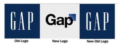 Source: Logo Redesign Case Studies
Here’s another example. Starbucks started off by introducing a brown logo in 1971. The color choice was easy to understand then. After all, coffee is brown.
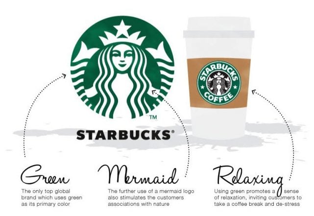
Later on, the company changed its color from brown to green, as it was changing its offering from coffee to more types of food. Green was also a good choice as it made customers feel the environment they were in was clean and fresh.
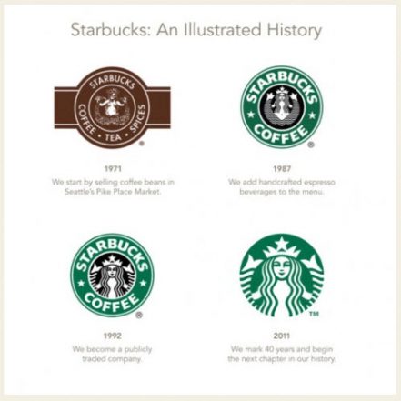
Source: Study of Consumer Psychology
Choosing the Right Color Combination
Choosing color can be a very exciting part of your marketing and branding strategy. Your marketing agency or graphic design team will come up with different color combinations for your brand (including fonts, logos, website design).
Make sure your team knows your brand inside out before starting the process. Take time to develop ideas and then decide which color combination represents your brand best and why. Rationalize your decision (e.g., “We are a food company, and we will use color red because it is known to increase appetite), but don’t over-analyze. Go with your instincts too.
It’s doubtful that you would apply only one color to your website or logo, so think carefully about what color combination would be most suitable. This is not always easy, but thankfully there are many free color palette tools and guides available and can be found using a quick search on Google. Tools like coolors and the Color Scheme Designer work great. Use them to pick a set of colors that work well for your company and your branding goals.
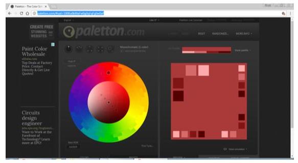
The above is an example of a free tool, Palleton. It is designed to create palettes of colors that work well together according to classical color theories.
The color of your font is also important, and must be a color that is easy to read and does not “clash” with the other colors on the page. Many companies use black and then use color to differentiate between headlines and subtext, or to bring attention to a specific word in a paragraph.
Below are some good examples from Color Theory: Contrast vs. Readability, explaining which font colors and background colors work well together and which don’t. Yellow text on a black background, and vice versa, is a disturbing combination that spells “panic” because of the convention of using it for warning signs.
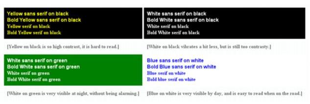

Use Color Theory
Below are some examples of the basic colors, what emotions they commonly invoke in people, and how you could use them.
Bear in mind though that color means different things in different cultures. For example, in India, red means purity, while in the US it symbolizes passion.
In his study “Color Assignment,” Joe Hallock points out that color preferences also vary between gender. For example, both males and females like the color blue but there is a notable gender difference in the color purple (23% of female respondents chose color purple as their favorite, but no males chose purple as their favorite).
Psychological Properties of Color
Red: power, energy, passion, courage. Food and drink companies often use red as it is very stimulating. Think Coca-Cola and McDonald’s.

Source: Logopedia McDonalds
Yellow: happiness, friendliness, optimism. Yellow effectively attracts attention. Nikon, Hertz, and IKEA’s logos portray warmth by using yellow.

Source: Logopedia Hertz
Orange: fun, action, excitement. Increases cheerfulness and optimism. If you are in the entertainment and youth business, consider using orange. Fanta and Amazon are good examples.
 Source: Logopedia Fanta
Blue: strength, confidence, loyalty and professionalism. Works best for business sites. IBM, HP, and Mirasee use blue effectively and professionally in their logos.

Green: wealth, nature, peace, kindness. Financial services always use green since it is associated with dollars. As for Greenpeace, Animal Planet, and Whole Foods, green evokes nature and wholesomeness.
 Source: Logopedia Whole Foods Market
Pink: a romantic and feminine color, associated with love and warmth. Think Victoria’s Secret, Barbie, and Dunkin’ Donuts.

Source: Logopedia Dunkin’ Donuts
These are just some examples.
Your color choice comes down to your target audience and what message you want to convey with colors. A small focus group will help you find out what colors your audience prefers and it won’t cost you much. Social media is also a great tool to learn about user preferences.
Your Brand’s Personality Matters
The feeling, mood, and image your brand creates play a role in persuasion. Be sure to recognize that colors only come into play when they can be used to match a brand’s desired personality. Without this context, choosing one color over another doesn’t make much sense, and there is little evidence to say that green will make people buy a product more often than blue.
Many studies have revealed that our brains prefer recognizable brands that we can associate with. The study, Color Research & Application, has found that new brands should also think about logo colors that differentiate from their competitors. So if the competition uses blue, for example, your brand will stand out if you use orange.
See how color is one of the ways Starbucks differentiates its logo from competitors:
Source: Small Business Trends
Keep it Simple
When choosing the right color combination, bear in mind that people like simplicity. In a study by University of Basel and Google, researchers found that “visually complex” websites are less preferred than simpler designs.
One of the best ways to deliver a lot of information in a short time is through visual content. 65% of people are visual learners, according to the Social Science Research Network. We perceive a picture or an image all at once, whereas reading or hearing often takes significantly longer to process the same information.
Keeping the color combination simple will make it more pleasing to the eye and easier to remember. A study from the University of Toronto revealed that most people prefer simple color combinations that include only two to three colors.
Test, test, test
Before you decide on the final color combination for your brand, don’t forget to test. Ask your target audience about their opinions and preferences. Give them a few options and see what attracts them most. Be open and accepting of criticism.
A few interesting studies show the importance of testing. For example, a button color test was done on Performable’s website with surprising results. Performable increased its click-through rate by 21% simply by changing its call-to-action button color from green to red.
When Heinz changed the color of their signature ketchup from red to green, it sold over 10 million bottles in the first seven months, resulting in $23 million in sales. That was the highest sales increase in the brand’s history at the time.
Over to You
I hope I’ve spurred your interest into how incredible color can be when used for branding and marketing.
The colors you use in your marketing campaign may be the component that will initially grab the attention of your audience. While there is no such thing as a right or wrong color, some colors may be more appropriate than others. Make sure the color combination of your brand supports the personality you want to portray, and don’t forget to ask your target audience about their preferences before making the final decision.
So, what is your experience with colors? How do they affect your decision-making process?
How to Make Money Blogging
Get the definitive guide on turning your blog into an income stream.
