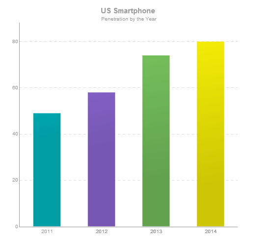
Seeing Is Believing: 8 Simple Ways to Use New Visual Content and Boost Your Social Media Marketing
Pooja Lohana
Once upon a time, bloggers would write long-ish posts with an image or two tucked in. Then along came Twitter, and we started to write posts in 140 characters or less.
Now, a new shift is happening. This time, it’s from written media to visual media. Every day, your audience is bombarded with tons of information, and they don’t know how to process it.
Luckily for us, humans are pretty good at remembering information when it’s presented in a visual format. That’s why the art of representing big chunks of data in easy-to-grasp visual formats is the new trend on social media.
Want to hold the attention of distracted, super-busy prospects? Want to make a statement in less than 3 seconds? Try visuals.
Why Go Visual?
In the interests of being clear, let’s take just a second to define what I mean by visual. “Visual” means anything that’s not text such as images, infographics, bar graphs, comic strips, videos, memes, cartoons, maps etc.
It is said that humans process visual information quicker than plain text. What can you do faster: Read thick novel or watch movies in your favorite genre? You’d be pushing to finish three books in a week , but you can easily watch three movies in a day.
On Facebook, once king of the text updates, photos will now generate 53% more likes than your average post. Videos are shared 12 times more than links and text posts combined. Following the trend, even Facebook lets you “highlight” your image posts to catch attention. Hubspot says that Google+, a visual channel, drove customers for 15% of the marketers in 2013.
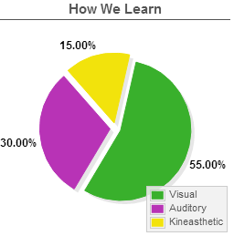
How We Learn
As you can see, there’s a good reason that social media sites like Pinterest and Instagram have grown so much in little time!
A lot of internet users are visual learners. This means they’re driven to read and share your content if it is accompanied by interesting visuals such as infographics and relevant images.
Consider the ways in which we learn:

- Learning by seeing (Visual)
- Learning by hearing (Auditory)
- Learning by touching or moving (Kinaesthetic)
- Or a mix of the above three types.
From extensive research, about 40—65% of learners are visual. The smallest group among the four is kinaesthetic.
Want to get noticed by someone big in your industry? Want to boost your content’s shareability online? Do this in the new social media by adding visual content to a plain chunk of text. Don’t forget your average web reader has an attention span that’s shrinking day by day!
It’s not rocket science to conclude that by including visual content in your marketing strategy, you are giving your potential customers what they want. They don’t want to sift through your long copy. They want you to present information quickly, and efficiently. Stand out from your competitors by listening to what your audience wants.
Plus, visuals are easily remembered, attractive, and can act as roadmaps telling your audience what to do next.
So now that you know visual content is a must-have, let’s look at how you can use visual content to better connect with, and engage, your audience.
8 Simple Ways to Use New Visual Content and Boost Your Social Media Marketing
1. Know Your Audience
A study done by Pew Research Center divides visual content users into two groups: creators and curators. Overall, 56% of online users will create or curate, and 32% will do both.
Visual content works better in new social media with a younger audience, as compared to those over age 50. If your target audience tends to be younger than 50, make use of inspiring images and videos for your social media campaigns.
Don’t take this as a rule of thumb, though – always test and refine your own results along with outside advice.
2. Blend Visual and Mobile
By May 2013, 63% of cell phone owners were using their phones to access the internet. 21% only used their phones to do any online browsing. Close to half of all social media traffic comes from mobile phones.

If you don’t have a responsive website yet (a website that works on mobile phones without breaking out), make it a priority for 2014. Consider offering smaller, suitable photos for your mobile site. With mobile, less is always more.
3. Use Infographics
As one of the first forms of visual content, infographics have been on the scene for a while. But, they can still be effective if done correctly and with proper fact-checking. There are 4 components to any good infographic: design, data, story and shareability.
Using infographics, you can instill a big chunk of data into interesting, easy-to-grasp visual snippets for your audience. If you’re a health food company, you can collect important data about the positive effects of an organic diet (or shocking data about the ill effects of junk foods) and showcase it using rich-colored infographics that pop.
When done right, your infographics can quickly go viral, which means more brand awareness and lead generation for your business. One great tool to create free and cool infographics is Visme.
4. Spice Things Up
Choose your visual content from a palette of images, infographics, videos, animations, and real human pictures (you can always create them in-house). Make sure your images add meaning to your text and don’t just occupy white space on your web page. And always, always be sure that you follow the copyright laws about using online images.
Use your visual content to weave a story – have a beginning, middle and an end. This makes users curious for your future posts.
Needless to say, do this within the limits of your time and budget, and in alignment with your brand values.
5. Add Calls-to-Action to Your Images
Make consuming your visual content as easy as possible for your audience. Help them connect the dots from what’s going on in your visual to what they should do next by adding text or a call to action to your images. Text will give your photo an edge over others, especially if you direct your audience’s thinking in a way that would be most beneficial to them.
6. Crowdsource Visual Content
Instead of creating your own content, why not invite your readers to create it for you? Big brands do this often, and so do smaller ones.

One author used her Facebook page to croudsource content for her latest book. She asked her fans to post a picture with her latest book for a chance to win a cool hamper with a moleskin diary, an autographed copy of her earlier book and a postcard with her favourite quote.
If you can invite your community to create images or videos to help solve a problem – like naming a new product or promoting your newest training program – they will be more than happy to chime in simply because the idea is engaging and fun.
7. Add Your Visual Goodies on Slideshare
Slideshare is a social media network that was originally created as a place to post your powerpoint presentations. While it is still under-utilized as a platform, it nevertheless delivers great results. The site receives over 60 million visitors each month, with the main demographic being business to business consumers who are looking for educational content.
Take advantage of this new social media site, and be sure to add your presentations, images, videos, animations, and any other visual content strategy you’d like to share with your audience!
8. Watermark Your Content
You don’t know how far your content will travel. Always add a watermark to make sure you receive due credit.
In the “salty water” image above, the creator adds a watermark on the right-hand bottom side.
This post talks more about adding a watermark to your images on Pinterest and guarding them against theft.
Your turn! Are you using visual content to connect with your audience? If not, will you be using more visuals in your mix now? I’d love to know what you think in the comments below!
fmengineers
What I’ve read has seemed entertained.
After reading your content without you order anything you seek to know more about you. Probably the next things you will do are sign up for your newsletter or follow some of your profiles in social networks.
How to assess whether content is quality?
Create good content on your site is also a way to improve the ranking in the search engines, increase traffic and get visibility. Google suffers obesity information and not in all cases “content is king”. For content are good needs to be:
Original and personality.
Relevant, useful and easy to share.
Must have a specific purpose.
It has to be written for a target audience.
Ana
I want to have a YouTube channel in addition to a blog about my topic. I’m still researching but I think I would have a potentially big audience, some over 50, some not.
I’m 59 and all the “big” YouTubers I watch regularly are twentysomethings. Are there any “big” people doing channels who are older?
Also, thanks for the suggestions on what programs to use but I wouldn’t know the first thing about how to actually use them. Someone should write up a course on the technicalities, from the very beginning, on using Pinterest, YouTube, and all the other social media. It would do very well!
Pooja
Hey Ana ,
Thanks for your comment.
Yes I believe there are many older people doing videos. All you need is to do some quick research.
I want to add that when you try to “do it all” and use every social media platform out there, it gets pretty overwhelming.
Instead, if you’re good with videos and you know your audience hangs out at YouTube, why not give it your full focus and worry about other channels later?
Just a thought. 🙂
Pooja
Carolynne
Hi Pooja,
This post is very timely for me. I recently have been contemplating adding video content to my weekly mails. You have given me several more ideas with this post. I have a great idea for an inforgraphic.
Thanks
Pooja
Awesome, good to hear that Carolynne .
Let me know if I can help in any way.
Pooja
Vicky
Hello Pooja,
Glad to see you here, Well the new social media is all about the digital sharing or we can also say most of times I can see an infographics has been shared.
Pooja
Thanks Vicky! 🙂
Sarah Kohl
Pooja,
Thanks so much for not just telling us *why* we should use visuals but also adding practical ideas *how* we can add visuals.
I had started with photos, your ideas to add a call to action on the image is intriguing. I plan to try my first infographic with your suggested link.
Thanks!
Pooja
Sarah,
I was personally frustrated by advice from pros about creating great visuals or writing epic shit. That probed me into writing the “how”.
And I am glad you could use the infographic tip. Let me know how you go with Visme.
Thanks for stopping by.
Pooja
Lynn Wallace
Recently, my daughter helped me get a short video together for YouTube. I made notes of all 8 points. Later, I will share with my daughter, as I do not know how to do technical stuff. How do you get a watermark up there. I have only heard of them before on checks. I may look into Slideshare and Pinterest later. I’m on Facebook, Linkedin, and Twitter with my video. I’m trying to get the word out there more. I’m an author and a speaker.
Pooja
Hey Lynn,
Thanks for stopping by.
Video can be very effective if done right. The first thing I’d look at is having a shorter video under 3 mins. if it’s an a book trailer.
You can add a watermark using Photoshop.
Or, a simpler way is to use PicMarkr.com.
Hope that helps!
Pooja
Katharine
Isn’t reading visual?
I think it’s really more about being too rushed, too busy, or too lazy, than being visual.
However, I do need to heed your warnings about watermarks. People claiming to me have used my stuff before, to my loss. 🙁
Pooja
Hey Katherine,
Your comment reminds me of a technique I learned in NLP (Neuro Linguistic Programming) where they taught kids to visually memorise a difficult spelling.
It was amazing when kids consciously converted the word into an image in their brains and recalled what they “saw” instead of what they read. They could remember a lot more quickly and easily.
So yes, you can read “visually” but I feel it has to be consciously done. 🙂
Pooja
Katharine
Well, I’m sure reading’s not auditory, unless it’s performed, right? So it must be kinesthetic? The eyes do move, true, and many people read better by moving a finger or piece of paper below each word…
That must be it! Thanks!
renee
Great, great article.
I do use video–so simple but effective. I have family, friends and followers ask me how to cook/prep a certain food–so I make a video. Food Network–NOT but it works.
Instagram has the option for a 15 second video–this is a fun challenge for me (since I can’t really say my name in less than 15 seconds!) to get me message out! It’s raw, authentic and totally me.
Pinning this post right now under blogging 😉 http://www.pinterest.com/reneebaude/
Pooja
Hey Renee,
You’re right, 15 seconds is hard but with lack of attention spans everywhere online (and offline), I think it could be well worth a shot.
Thanks for the pin! 🙂
Pooja
Leslie Jordan Clary
Great post! I’ve also been using a lot more visual — and audio — and I really like the added texture it brings to an idea. Nice list of resources too. I’m going to look into Slideshare.
Pooja
Hey Leslie,
Yes, Slideshare is pretty cool. Let us know how it goes!
Pooja
Sally
Yes! I use visuals – it’s fun creating an image to go with a post.
But more important than that, my sites get a lot of traffic from Pinterest. If your audience is on Instagram, Pinterest, etc. then visuals are a must. And of course Google+ loves images too.
I get frustrated when I find a great article that doesn’t have a decent image. It stops me from sharing on Pinterest, Google+, etc. That’s several lost shares for the author.
PS: I pinned this post!
Pooja
Hey Sally,
Thanks for your comment. I agree — it matters all the more where your traffic hangs out. Like I said, a lot of people are visual, so it helps to add some juicy images to your post!
And thanks for the pin! 🙂
Pooja