What Makes a Great About Page?
Razwana Wahid
Apart from the Home page, which do you think is the most visited page on your website?
Don’t know? Here’s a hint: It’s also the page that most businesses make the biggest mistakes on.
Still not sure?
The answer: It’s your About page. And mistake # 1 most businesses make is assuming their about page is about them.
Newsflash! It’s not all about you! Well, that isn’t that much of a newsflash, is it?
If you’ve read Firepole for any length of time, you already know that your marketing messages are more about your customers than you.
However most business owners start writing an About page and immediately go into storytelling mode about their life to date?
It’s time to make that wrong, right, among others.
Today we’ll talk about the most common mistakes made on About pages and how to fix them as well as exactly what your About page needs to say in order to optimize it for your business goals.
Most Common Mistakes and Action Points to Fix Them
As I already mentioned, the first one is talking about themselves instead of their customer. Let me say again:
[tweet_box design=”default”]Mistake # 1 most businesses make is assuming their About page is about them.[/tweet_box]
Action point #1
Review the statements about you currently on your About page. Rewrite them so they focus on your customer instead.
[tweet_box design=”default”]Mistake #2: Not explaining the purpose of the business on your About page.[/tweet_box]
Yes, your audience wants to get to know you but your visitors? They want to know how your business will help solve the problem they’re having.
Notice the subtle difference there?
Your audience = people who already know you because they’ve heard from you before (on email, on social media sites, etc.).
But visitors? Your visitors are those that have stumbled onto your site and have visited your About page for more information. These people will eventually become your audience, if you convince them first.
Action point #2
Read your About page and notice all the statements that start with I or We. Rewrite these so the focus is on your visitors and what’s in it for them.
[tweet_box design=”default”]Mistake #3: Making your About page long-winded and difficult to read.[/tweet_box]
Most visitors take 4 seconds to decide if your website is worth reading. If your About page has blocks of paragraphs that read more like a novel than a website, you’ll lose them instantly no matter how interesting the content.
Action point #3
Review your About page and break it up by using bullet points, subheads, and shorter sentences.
[tweet_box design=”default”]Mistake #4: Not having a Call to Action (CTA) for your About page.[/tweet_box]
I see this a lot on About pages. Yes, the page needs to inform the visitor about your business and its benefits, but without giving them an idea of what to do next? You’re encouraging them to click aimlessly around your site.
Action point #4
What do you want a visitor to do once they’ve read your About page? Sign-up to your email list? Get in touch to hire you? Connect on social media? Direct them to this by adding a link to whatever action you want them to take.
[tweet_box design=”default”]Mistake #5: The fifth and final element isn’t a mistake per se but a missed opportunity.[/tweet_box]
About pages are the perfect opportunity to use images or video to give your brand more personality. People connect with people, so use videos and images to introduce yourself.
Action point #5
On your About page, reread the section that talks about you. Consider how this could be brought to life through images, videos, or other media.
Questions the About Page Must Answer
Now that we’ve covered what your page shouldn’t be doing, let’s look at what it needs to do.
Every visitor to your site will have specific questions they want your site to answer. The perfect opportunity to answer these questions is on your About page.
The key to ensuring these questions are answered is to structure the page in a specific order.
Here’s my recommendation on which questions to answer and in what order:
#1 What’s this website about?
This is the section that outlines at the business does. For example:
Content marketing for small businesses. The section doesn’t have to be very lengthy – just using enough words concisely to describe what you do.
#2 What’s the benefit for me to be here?
Any visitor to your site will stay on your site if your content addresses what’s in it for them to be reading. So let them know they’re in the right place.
Following the example of the content marketing business above, this section would say:
You’re in the right place if: You keep telling yourself you should write content for your website, but never get round to actually doing it.
You’re in the right place if: You know the value content brings to your business but just don’t have the time to write it.
You’re in the right place if: You’d rather serve your clients than spend time writing blog posts.
#3 Who are you?
This is when you can start giving details about yourself. Because you’re keeping your audience in mind, remember to give an example of a result your clients have achieved after working with you.
I’ve helped X number of businesses increase their reach by X amount.
Company X’s subscriber list grew by the thousands after implementing our content marketing plan.
#4 Why should I trust you?
This is when your experience, qualifications and skills become important. Shout about them!
How many clients have you worked with?
Do you have a book published (being a published author increases credibility).
What results have your clients achieved?
The more examples you can give of why you’re trustworthy, the more likely the audience is to want to work with you.
#5 What should I do now?
This is the Call to Action on the page. Give the audience one action to take. Do you want them to sign up to receive updates from you, start working with you, or something else?
Make the CTA clear to the audience by telling them to:
Add their email address.
Click here to work with you.
Adding a link to another page you want to direct them to.
Examples of Great About Pages and Why They Work
Below are some examples of effective About pages and what key lessons each teaches us:
Here’s how the About page of RebootAuthentic.com opens:
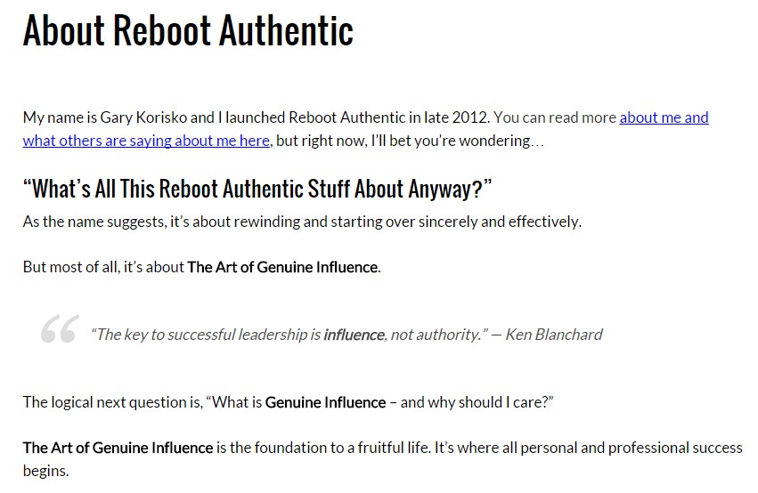
Notice how the page opens with About Reboot Authentic, and not about the business owner, Gary Korisko. To give the audience a human being to connect with, he adds his name. But details about him personally are on a totally different page.
He then uses the questions the visitors are asking as sub-heads, such as What’s All This Reboot Authentic Stuff About Anyway?
It’s a clever move – making it obvious that the questions the visitors have are being answered throughout the page.
Now let’s see how the page closes:
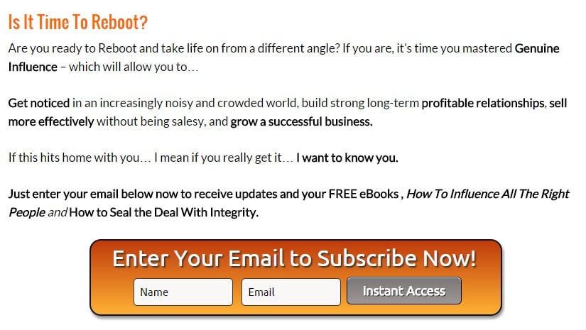
It’s clear Gary wants you to sign up for updates from him, and nothing else. This CTA’s clear and to the point.
Now let’s take a look at how Unbounce.com opens their About page:
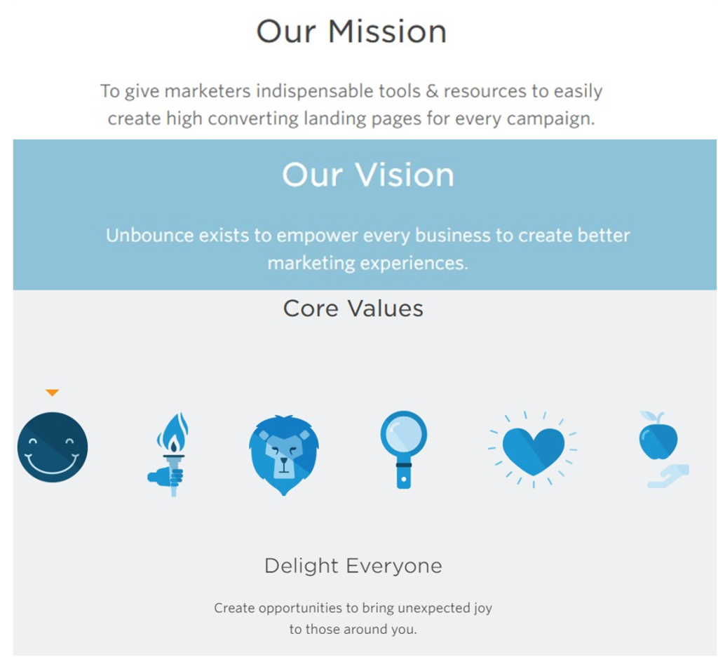
Their statements are very simple and talk about exactly what they do for their visitors. Talking about a vision and mission also gives you the idea that they’re a large company.
And as a large company, they’ve added personality to their About page by introducing their team:
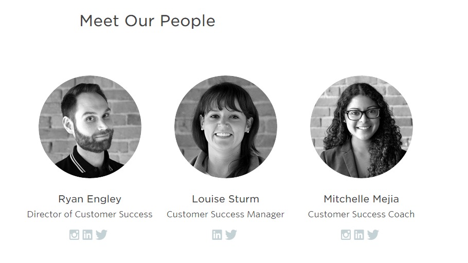
Here you see images of their team which comforts the visitor knowing that there are real people behind the business. A few videos here would also work well.
And finally, here’s a 3rd example of an About page done well from InternetBusinessMastery:
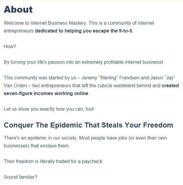
This opener talks about the community they’ve created and what they’ve achieved. It gives the visitor something to aspire to and tells them they are in the right place.
Their About page also closes with a very specific action:
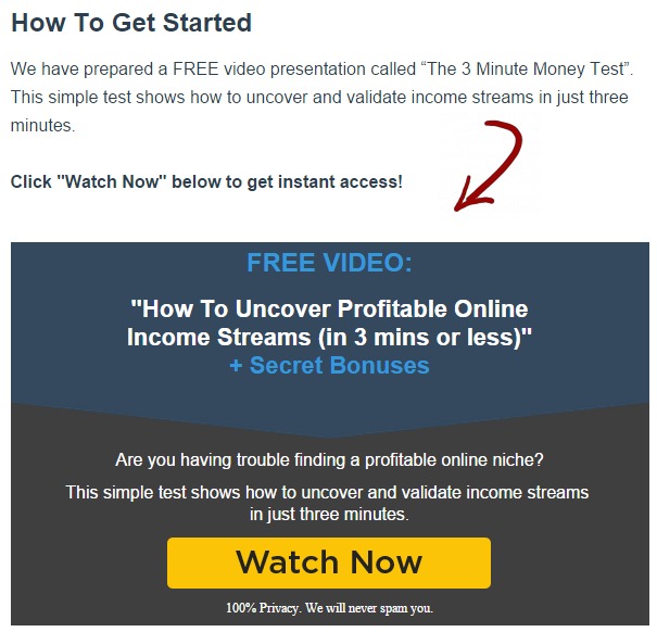
You can see that they want to give you immediate benefits before you leave the page, and direct your vision towards that.
The About page on your website is often ignored for conversions as most people assume it’s there for information purposes only. This article has shown you how you can take advantage of this prime piece of website real estate to encourage your audience to connect with you and engage in your business.
Over to you: Having seen the theory and some examples, what one thing will you change on your About page?
Don Wallace
Very helpful, Razwana. Thanks!
Razwana Wahid
Glad to read that, Don 🙂 🙂
Nida Sea
Great post! Now I have some better ideas to fine tune my about page. I never thought about putting a CTA or a video there. Definitely going to update it to reflect the points in this post!
Razwana Wahid
🙂
Let us know how you change your About page, Nida !
Jason
Hey
Yea, i did have my pic on there. I guess after so many times of changing my blog around, i just forgot to put it back up there
Jason
Jason
RAZWANA,
What an awesome name.
Thanks for the amazing read, everything you have said about , an about me page is true.
Im a big believer that your about me page is the most important on your site, tells your readers about almost everything they need to know about you.
I think its so important that i wrote a post about it, check it out
Thanks
jason, (guy with the boring name lol)
Razwana Wahid
🙂 Thank you for the compliment, Jason.
It’s the most visited page after the Home page – it needs tlc and the right message. I’d like to see a pic of you on yours, Jason – it’ll help your audience connect with you.
Thoughts?
ling | business-soulwork.com
Great points. I most resonate with “it’s not about you” and “adding personality.”
I do think that visitors come to this page to learn more about you, so some personal story is a great way to build personal and emotional connection.
It is, however, important to position the stories to show why your experience and story is relevant to your visitor/ideal clients. We are not telling our life story here. The about page is about sharing our story to show our relevance. It is about tapping into emotions that transcend our own stories to connect with others.
Razwana Wahid
Hi Ling – it’s absolutely true that this page can build a personal and emotional connection with the visitor. There’s definitely a balancing act between making it both about you and about them !
Diana
I will definitely consider this for my new website. Very smart advice. Thank you.
Razwana Wahid
You’re welcome, Diana 🙂
Steph Morrison
Great tips I’ll remember well for helping clients with their website content!
As a solopreneur, I thought these ideas didn’t pertain to my freelancing business website, but I can see how it would be much more effective for potential clients to have an about page to view with these action steps implemented as well as a page more about me should they care to view it. Will definitely add an About page as outlined here to focus more on prospective clients.
Razwana Wahid
Hi Steph. Absolutely – your website is either the first encounter potential clients have with you, or they browse it to find out more after first getting to know you.
Writing this with your clients in mind is a great way to build that rapport.
Thank you for taking the time to leave a comment.
Antoniya K Zorluer
Hi, Razwana, and thank you so much for this post! It comes just in the right time as I have been struggling with an About Page for a particularly picky client for the past two weeks! I just skimmed through your article but I will look at it in detail and apply your tips to my copy when I re-work it tomorrow and let you know if it does the trick (finally :). Great timing and very detailed, thank you!
Razwana Wahid
That’s great news, Antoniya – definitely let me know how the writing went.
Bettina
Thank you for this amazing and very helpful post! I found a lot of things which I can use for my own website and to support my clients.
Best from Germany
Razwana Wahid
Hi Bettina – you’re very welcome. Which idea will you apply to your page?
Bettina
Hey Razwana, I am doing a relaunch on my website during the next month and I will check every step you have described to make sure I didn’t forget anything 🙂
Nicki Kelly
I’m just starting on my website and because it was such an easy thing to do, the About Me page was one of the first ones I created.
Well, now I un-created it. Hmmm.
You mean the world is not really that interested in me? Bum. Am I allowed to write Bum here? 😉
Thank you for pointing me in the right direction with your interesting post! It was a great article which I was able to put into action right away.
Razwana Wahid
That sounds awesome, Nicki. Website pages are always evolving (I constantly tweak the copy on mine).
Your audience is totally interested in you – just a version of you that they connect with:-)
And since you wrote ‘bum’ and your comment wasn’t deleted, I guess it’s ok …!!
Jennifer T. Grainger
I love the synchronicity of the Universe! Just yesterday I started reworking my About page to bring it up to date. Now I have really good advice on how to make that page work for me! Thank you.
Razwana Wahid
Sweet! Would you share the final page with us when it’s ready? I’d love to see it, Jennifer.
Jennifer T. Grainger
Ooh . . . thank you! Yes I will share my new About page.
Jennifer T. Grainger
Hi Razwna,
I am taking you up on posting my new About page, with a bit of trepidation, I must admit, but I really do appreciate any feedback you can give me. A headsup, I am in the midst of designing a new website, but I wanted this up ASAP so it is on the website i will soon be abandoning. One limitation is the inability to have a text box in which to put client testimonials so I had to you asterisks to delineate them.
Thanks a MILLION in advance,
Jennifer
PS I will also be posting new content on my home page and adding an Is This You? page later today.
Elke
This is perfect! I’m in the middle of redoing my website pages and is exactly what I needed.
I love what you said about the CTA. You don’t think about putting it on your about page. Thanks!
Razwana Wahid
You’re very welcome, Elke 🙂
JB
Wow, so if everybody takes this advice, there will no longer be even ONE page on a site that isn’t working me. Believe it or not, I KNOW your site wants my email. I go to dozens of sites in the course of each month where I can’t figure out WTF they actually DO without conducting a full Gestapo investigation. Even the About page frequently is no help. Sure, if I hung around the site long enough I’d figure it out, but sites don’t get that much of my time. You gotta tell who and what you are w/o wasting my time.
NOT ONE of the above examples of About pages tells me what those sites do, offer, make. They only assure me how great they are and how great they’re going to make me. I figure that if a site is afraid to tell me what they do (and why I care) on their About page, that fear probably is justified. When the About page becomes not only useless but just another squeeze page, I know I’m in the wrong place.
I don’t hate the concept of a sales-y About page, but if you don’t tell me why I shouldn’t leave your site, I will leave.
Out of curiosity… pray tell, where on earth should the description of what the site does, why it exists and why I should care (the stuff that oughtta be on the About page) go on the site, if not an About page?
Razwana Wahid
Hi JB. Thank you for taking the time to comment. I appreciate your perspective.
The answer to your question is right there in the article, under ‘Questions your About page must answer’. The first question is ‘What’s this site about?’
I agree that some websites take a long time to get to the point .. and some don’t at all (like mistake #2 listed in the article).
The examples in this article don’t show the entire About page for the businesses. Using Unbounce.com as an example, their mission is clearly stated. Granted, this may need some detail to get the point across fully – this largely depends on if you’re their target customer or not.
What examples do you have of About pages (or any page of a website) that tells you what the business does? I’m sure the community here would like for you to share (I know I would).
Cathy Goodwin
Good point – it’s not about you! Another mistake I see often is having the business owner’s life history … sometimes going back to grade school. Unless it’s completely relevant … who cares?
Razwana Wahid
Right, Cathy? The entire life history is best kept to memoirs .. or Christmastime.
The word relevant is definitely … relevant. Choose those stories in your life that your audience will connect with most.
Thank you so much for your comment 🙂
Zvidzayi
I will definitely use this i didnt realise
Razwana Wahid
Awesome 🙂