What is a Landing Page? (+ Landing Page Examples for 2022)
Sadaf Tanzeem
As an online entrepreneur, you know it’s essential to attract visitors to your site and convince them to sign up for your email list.
But no matter what you try, you just can’t seem to get email subscribers. And you’re wondering what it will take to get people to join your list.
Well, a good landing page can help.
An effective landing page is a powerful tool that can help you gain more subscribers, improve your conversion rate, and ultimately boost your sales and revenue.
But what exactly is a landing page, and what does a good one look like? In this post, we’ll define what landing pages are, and then we’ll look at 15 great landing pages and explain what makes them effective.
Ready to get started?
Then let’s begin by looking at the definition of a landing page.
What Is a Landing Page?
A landing page is a standalone web page where website visitors land after they click on a link in an ad, email, or elsewhere.
Have you ever clicked on a link that directed you to a unique web page with a single CTA such as: download an ebook or a white paper, register for a webinar, or fill out a software demo form?
Well, that’s a classic example of a landing page.
Unlike most web pages, a landing page is designed with a single focus. This means you make only one offer and direct the entire web page’s copy towards it. And that’s one of the major reasons why it converts.
Benefits of a Landing Page
Now that you understand what a landing page is, let’s discuss if it’s really worth creating. Why can’t you just link your ad to your website (or homepage)? Lots of businesses do that, after all.
Here are three important reasons why you should consider linking your ads to a landing page.
1. Boosts Credibility and Conversion Rate
The landing page addresses the major pain points of your potential clients and customers, shows them you have their best interests in mind, and offers a perfect solution for their problems.
Plus, by adding testimonials on your well-planned landing page, you tell your prospects that it’s not your first time solving these problems. Social proof can increase your conversion by 15%, so you’ll definitely want to include it on your landing page.
2. Improves Paid Search
Linking your landing page with paid Search Engine Marketing (SEM) campaigns instead of your homepage can also improve your conversion rate.
If someone clicks on your paid link to check out a specific offer, multiple links on the homepage can distract them and make it difficult for them to locate your offer. This is likely to result in them taking no action at all.
On the other hand, a highly focused landing page brings them directly to your offer, so they can easily sign up for it if they choose.
3. Generates Data and Insights
A landing page can also help you understand user behavior and insights. Just link your various marketing campaigns for your offer to a single landing page to find out which campaigns are bringing in most of the traffic.
You can also use landing pages to collect email addresses, names, and other basic information from your prospects, which can help you to learn more about them.
Landing Page Best Practices
Now that we’ve covered some of the main benefits of landing pages, it’s time to learn what it takes to create good landing pages that convert.
1. Be Clear on Your Goal
The number one thing you should be crystal clear about while creating a landing page is your goal. You should know whether you’re creating this landing page for email sign-ups, sales, some informative download, software trials, or webinar sign-ups.
2. Make Your Landing Page SEO-Friendly
Be sure to include long-tail keywords in your landing page’s copy. These are specific key phrases with 3+ words that offer good search volume and less competition. For example, “landing page” is a keyword, while “landing page for entrepreneurs” is a long-tail keyword. It’s highly specific, more targeted, has a good search volume, and is less competitive than the keyword, “landing page.”
You can also create separate landing pages for the same offer targeting different personas. If you choose to go this route, be sure to use specific keywords that resonate with each persona. For example, you might create separate landing pages for the same medication for doctors and pharmaceuticals sales representatives, and include different keywords on these pages.
3. Follow the Rule of One
One of the best ways to ensure your landing page converts is to follow the rule of one.
In other words, make only one offer. If you’re trying to convince people to download your ebook, avoid mentioning your webinar, online course, or podcast.
You’ll also want to target only one benefit. Your product or service might have multiple features or might be solving more than one problem. But figure out the biggest pain point of your audience to highlight on your landing page.
Finally, target only one type of audience and use only one image adding value to copy.
4. Include Social Proof
Another best practice is to show credibility on your landing page. It can be in the form of happy customers’ videos, testimonials, and case studies. Or, if you’re lucky enough to have a popular product, mention the number of users.
5. Keep the Copy Concise
Make sure you include the information in the form of short sentences and bullet points to keep your copy concise. This helps you provide more information in fewer words, keep your readers attention, and helps them decide faster.
6. Design Your Page Wisely
While designing your landing page, make sure to remove all the navigation elements from it to prevent your visitors from getting distracted.
In addition to that, choose the color of your CTA button wisely. Red, green, blue, and orange or yellow are some of the best colors that are known to convert.
7. Add Call to Action
On your landing page, be sure to add a clear call to action. Make sure your headline, page copy, and the accompanying image align with it.
If you’re helping people make an informed decision with a lengthy landing page, consider repeating your CTA multiple times. If you opt to do this, remember that the best positions to add multiple CTAs are the beginning, the middle, and the end.
15 Great Landing Pages Examples
Now let’s turn our attention to some examples of real-life landing pages and look at what makes them effective.
1. Shopify
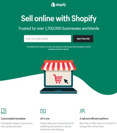
This landing page is pretty simple with no navigation elements, concise copy, and a big number of current users—which shows credibility.
Michael Port, in his book, Book Yourself Solid says, “Your job is not to make the sale right off the bat, but to take them to step 2, 3, 4, and so on, until they finally buy from you.”
The free trial landing page of Shopify is doing exactly that without overwhelming their visitors with big paragraphs or forms. Instead, they use bullet points and ask their visitors to enter their email addresses only. Plus, the page has only two links, both encouraging the visitor to take the free trial.
2. Wistia
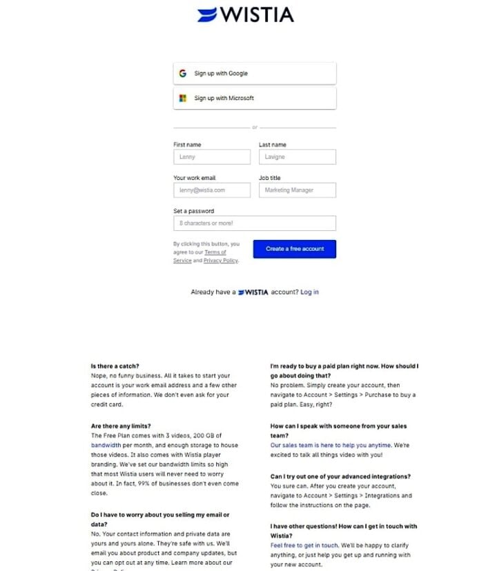
The second landing page on our list is from Wistia. It’s a video hosting platform created for B2B marketers.
Their landing page is also pretty simple with minimal clutter. No background image or navigation elements are there to distract visitors from the main action.
In addition, the white background makes the CTA button stand out. Such landing pages are great as they load faster and help the visitor take quick action. That’s because there’s nothing on this landing page other than a form to fill along with a bunch of FAQs.
3. Khan Academy
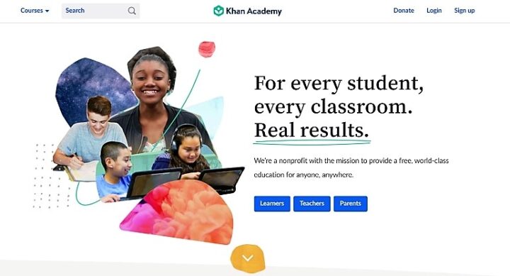
In this example, the company is actually using its homepage as a landing page. Even though it’s a great technique, it can get difficult to optimize it to get better results as a website targets more than one buyer persona.
But this landing page is doing it efficiently. It’s designed for three types of visitors: the students, the teachers, and the parents. And the rest of the page aims to make the respective visitor familiar with what they’ll get out of this platform. And since it’s a big page, the CTA is repeated multiple times.
This means when someone is ready to take action, they don’t need to take the extra step to scroll up.
4. Hubstaff
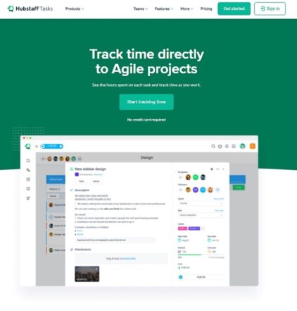
This landing page is a bit different. It includes all available navigation elements, a simple CTA button, and a very concise message instructing what to do.
Hubstaff is a company that offers time tracking software. And this landing page is part of an SEM campaign. So the person is definitely looking for some time tracking software when this page shows up. If they decide to click on it, instead of a form to fill out they get a page instructing them to click a button to start tracking time.
Their natural instinct would be to click there.
And after clicking on it, a form shows up for them to fill out. So, basically, this landing page is designed to appear like a time management tool to get the visitors to take the right action.
5. One Year No Beer
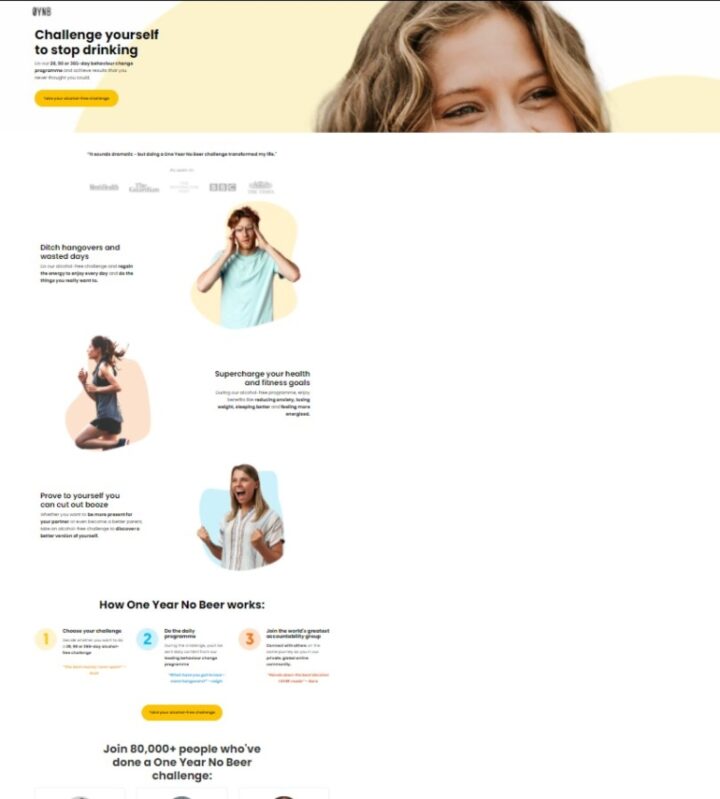
To help visitors convert by taking a challenge, OYNB shows an image of a former real member with all the details: her name, the challenge she took, and her testimonial of how it changed her life.
They’re showing credibility right from the beginning. And instead of adding what the challenge has to offer, they addressed the pain points of the visitor and described how the challenge can help them overcome these problems. These things really matter, as you always have to make it about them.
Also note that they chose the color of their CTA button very carefully. Yellow is related to happiness, and it resonates with their cause here.
6. Nauto
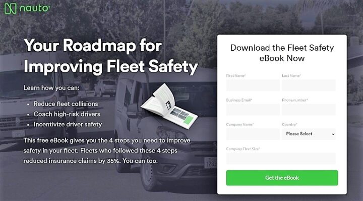
This example is from Nauto, a platform for self-driving cars.
The purpose of this landing page is to offer an ebook to download in return for some data of their prospective clients. To encourage people to download it, the landing page throws some light on the content of the ebook.
Plus, the color contrast puts all the focus on the CTA button. It’s a great way to use your branding color in your call-to-action.
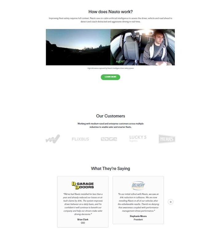
Since it’s an ebook download landing page, most people would just be interested in the free resource they’re getting. Still, they’ve also added a video showing how their software works at the end of the page, in case someone wants to know.
7. Industrial Strength
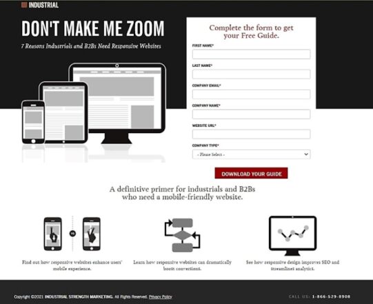
This landing page is simple. The entire focus is to prompt the visitor to fill the form in order to increase the conversion rate. If you take a close look, they’ve also chosen the colors quite wisely. Even though their brand color is orange, they made their CTA red because it’s known to convert.
The copy is concise, delivering emotion and attacking their target prospects’ guilt of making their customer’s browsing experience miserable. There are absolutely no links besides the CTA to avoid any distraction. Plus, the black and white background makes the form stand out, encouraging people to take action.
Everything together makes it a perfect landing page that’s created solely to ensure action.
8. HubSpot
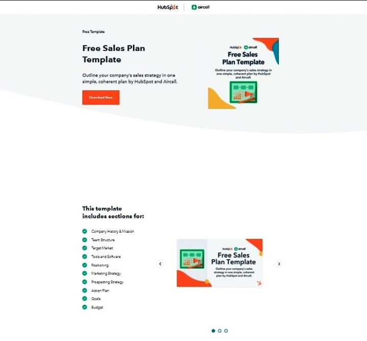
HubSpot has a really unique strategy. They have a resource to download with every article on their blog, which helps them capture as much user data as they can.
Just like most landing pages we’ve discussed so far, they have no navigation elements, their copy is concise, and it includes just one image.
The thing to note is that just like Hubstaff’s landing page, there’s no form here, either. It only pops up when you click the download button.
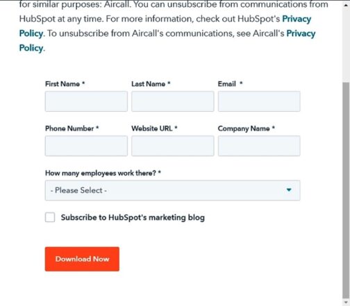
And even though the form that appears has seven fields, the small size of empty boxes prevents it from appearing overwhelming.
9. Amazon Prime
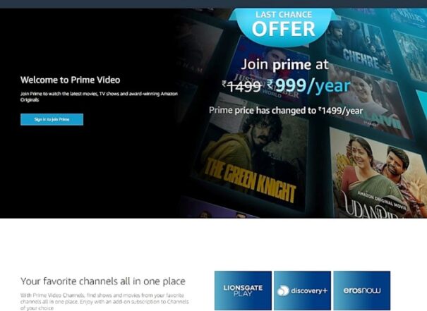
This is another great example of a landing page that incorporates the brand’s color in the CTA. To make sure their CTA button stands out, they contrasted it with a darker background.
The black color makes it easier to skim through the page, implying it’s user-friendly. The CTA is repeated whenever new features are introduced, making sure if the visitor decides to take action, it’s just a click away.
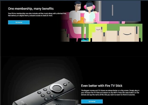
Plus, some of the images describe the feeling you will experience if you have Amazon Prime. As you’ve probably heard, sell the experience, not the product.
10. Sheffield Metals International
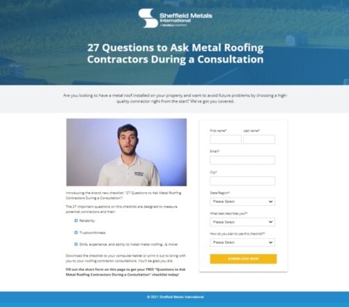
In the world of marketing, your hook plays a very important role. And that’s what’s different about this landing page. They included a video of a real team member and a question at the top to filter out the audience.
The copy is concise and includes bullet points. Plus, despite having a blue brand color they’ve made the CTA yellow, matching it with the frame of the video and preventing it from blending with other colors on the page. Remember, the CTA must stand out. In addition to this, the color is again chosen from the ones known to convert.
11. Bills.com
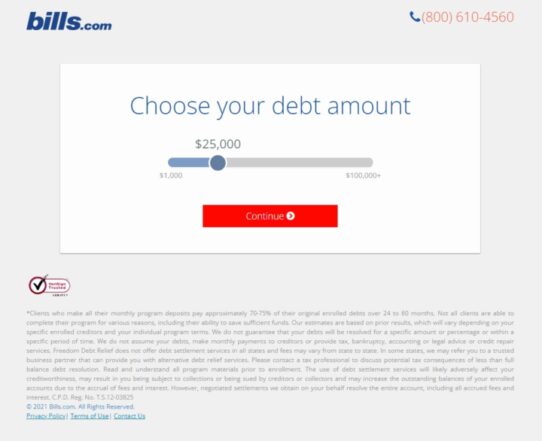
This is a different type of landing page that asks you to answer a few questions before you can access their offer. It’s another technique to hook the visitor and get some good information about the target audience in the process.
So, the people who get here would definitely be in debt and can relate to the questions asked. And after answering them all, they’ll feel compelled to find out the results. So now, the visitor will fill the form because they need it.
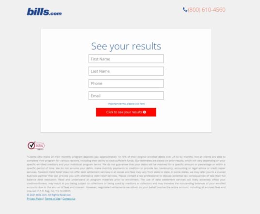
So, basically, the idea here is, don’t sell, make them want to buy it.
12. SmartBlogger
So what’s special about this landing page?
It has no fluff, portrays exactly what their target audience wants – being able to work from anywhere in the world, even a beach – credibility, and a bit of information about what the visitor is getting.
However, here’s one thing to note, along with showing a bunch of famous logos for their credibility, they’ve used the first name of their instructor while describing the perks. It means that this landing page is only targeting the people already familiar with the company, who have checked their product before or have bought from them in the past.
Also pay attention to the number of links: there’s literally only one.
13. Semrush
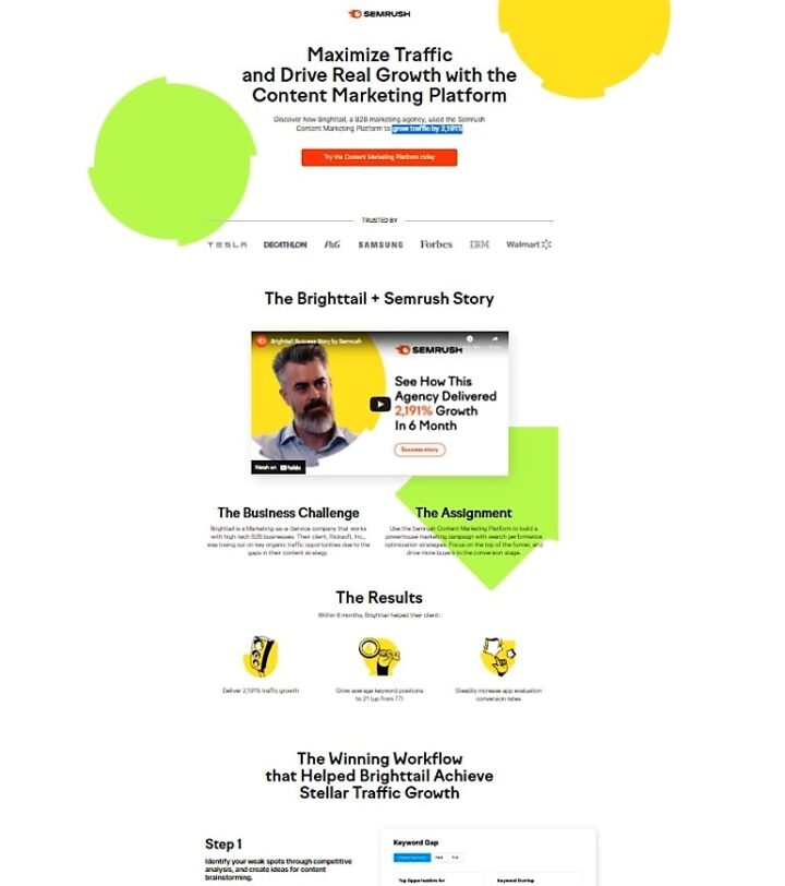
This is one of the best landing pages so far. It consists of one big headline addressing the exact results their target audience want. Plus, the text below shows what exactly they’ll get in bold numbers.
But what makes this landing page special?
Their credibility is a success story of a client.
They’ve included a brief video of the client, the challenges they were facing, the step-by-step process of how the company helped them, the results they got, the time it took to get those results, and the final testimonial of the happy client at the end.
There’s so much information, yet they deliver it without overwhelming the reader. The landing page design is remarkable.
14. Call Center Studio
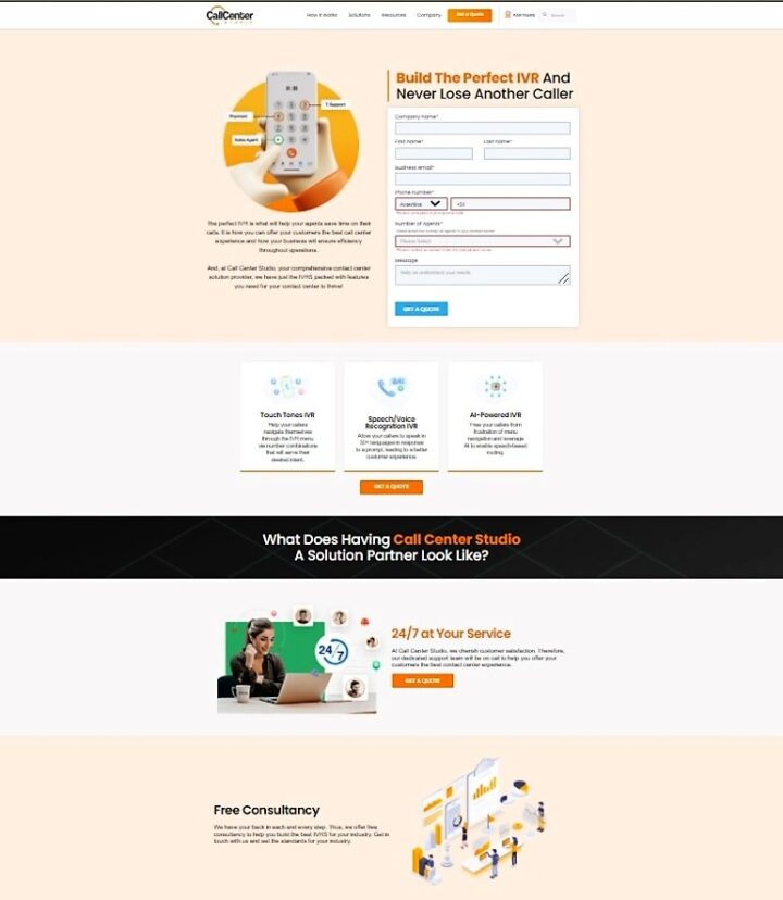
Call Center Studio is a platform selling call center software that helps companies manage the calls of clients and agents.
On the left side, they describe, through words and the image, how their software can help. Hence, consuming minimum space – an example of saying more using less.
Also note that if one decides to scroll down the page to read all of their features, the CTA is available after every third feature, encouraging the visitor to take action.
Here’s one thing that can be changed for this landing page—the location where they show their trusted customers. You have to scroll all the way down to see it, when it could have made a better impact at the top.
15. Copyhackers
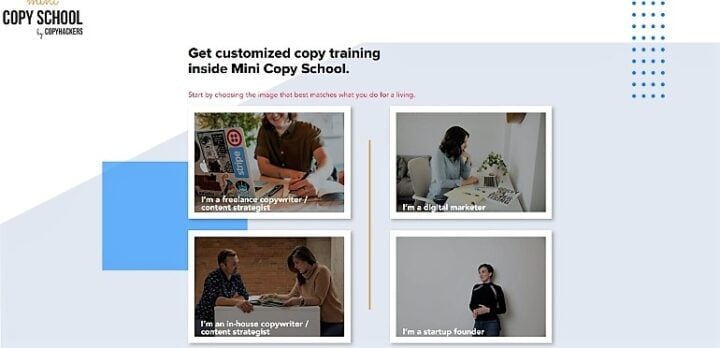
This landing page has much less copy than any of the landing pages we have discussed so far—four images with a description and a headline, that’s it!
However, they made sure to keep the text inside the images personalized to their visitors. Personalization goes a long way.
So if you’re looking to build an email list and have a similar resource to offer, consider this type of landing page design. It helps you target more than one type of persona at once. You can also segment your audience right from the start this way.
A Great Landing Page Can be a Game Changer
But don’t take my word for it.
Test it on your own.
Create a landing page for each of the different marketing or ad campaigns you’re running and check the results for yourself. If you’re doing it yourself, you can use Mailchimp’s landing page feature to create unlimited free landing pages using this platform.
But make sure to keep them simple and follow the rule of one. It reduces the distraction and helps your visitor take quick action.
Bear in mind, the ultimate goal of a landing page is conversion. The more focused it is, the better chance you have to convert your visitors into leads, and eventually into paying customers.
Master the art of the landing page, and soon your struggles of getting your visitors to sign up will end for good.
about author
Sadaf Tanzeem
Sadaf Tanzeem is a B2B & B2C freelance writer for hire. She is on her way to make boring content of blogs sparkle and encourage readers to take action. Check out her full portfolio or drop her a line.
Read more posts by Sadaf Tanzeem