15 Amazing Ad Copy Examples for Converting More Leads
Willy Wood
In the digital age, ad copy stands as your silent, 24-7 salesman in the online world, bridging the gap between your business and potential leads.
Crafting ad copy that not only grabs attention, but also converts readers into customers is an art form that many strive to master. With the right words, you can evoke emotions, spark curiosity, and drive action, turning casual browsers into loyal customers.
In this article, you’ll learn:
- What ad copywriting is and its pivotal role in digital marketing
- How 15 exceptional ad copy examples work to drive conversions
- And how you can apply these lessons to your own campaigns
Stay tuned as we dive into the world of ad copywriting, exploring examples that have set the bar high for turning leads into sales. Use these examples as models, and soon your ads will be converting like crazy!
What Is Ad Copywriting?
Ad copywriting is the art and science of crafting written content (copy) that’s specifically designed to prompt action from its readers.
This type of writing is used in advertising and marketing campaigns, including display ads, flyers, posters, billboards, social media ads, mobile ads, and more, where the main goal is to drive consumer behavior towards purchasing a product or service, signing up for a newsletter, or engaging with a brand in some other meaningful way.
The length of your copy depends on the amount of space you have to work with, but generally, effective ad copy is concise, sometimes just a few words. But those few words must be compelling and tailored to the target audience, ensuring that the message resonates and elicits the desired response.
Good ad copywriting blends creativity with strategic thinking, employing persuasive language, emotional triggers, and clear calls-to-action to convert prospects into customers.
But as we prepare to delve into the world of ad copywriting, it’s essential to understand that at its core, it’s about connecting with people on a level that moves them towards a specific action.
The examples in the next section will show you how to make that magic happen.
15 Amazing Ad Copy Examples
Let’s take a look at a variety of examples that use different approaches to grab attention and convert readers or viewers into customers. Some of these examples are from huge, iconic companies (Apple), while others are from not-so-well-known companies. Some are creative, while others are more straightforward. Some are matter of fact, while some are humorous.
Bottom line, there are many ways to make a sale. Hopefully some of these examples will resonate with you and your business.
Example 1: Apple “Think Different” Campaign
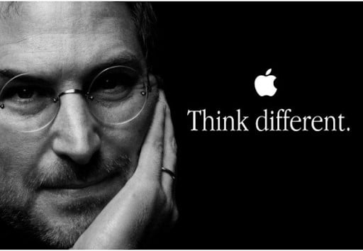
What Makes It Effective: I won’t go into the well-documented story behind this now-classic ad campaign from 1997 – one of the most successful in advertising history. If you want the full story, you can check it out in this Forbes article.
But for our purposes, let’s just focus on the specific ad you see in the image above and see what we can learn from it.
As far as the copy itself goes, the ad uses a grand total of two words, a verb and an adverb. Conciseness in ad copy is always a virtue. The fewer words you use (providing they do the job), the better. Also, starting with a verb is a solid approach, as it throws the reader into the action immediately.
But the key to the success of this ad (and the entire “Think Different” campaign) isn’t so much in the details of the copy, but in the benefits the copy promises. Apple at the time was the up-and-coming, cool kid on the block, going against traditional companies like IBM. For people who saw themselves as different, as creatives, Apple was promising them products that would help them become the best version of themselves.
It’s an aspirational and transformative story, told in two words. And that’s why it’s a classic.
Example 2: AppSumo Plus
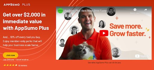
What Makes It Effective: I put this ad immediately after the Apple ad above for a reason: it’s basically the complete opposite approach – and yet they both work extremely well.
This ad for AppSumo’s membership program, AppSumo Plus, hits a number of the traditional approaches to convincing people to buy a product or service. It hits the value trigger hard with the headline, “Get over $2,000 in immediate value with AppSumo Plus.” It hits value again with an additional “10% off every tool you buy.” It offers risk reversal with “Cancel anytime.” And it hits social proof with “66 reviews.”
And if you click on the two-minute YouTube video, you get a humorous, engaging pitch that goes through the specific features of the membership offer.
Apple did it with a two-word appeal to transformation. AppSumo does it with a lot more words and a more traditional appeal to the pocketbook. Both work.
Example 3: ClickFunnels Free Trial
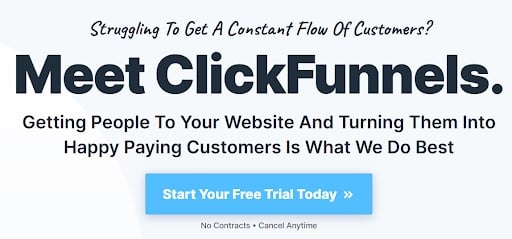
What Makes It Effective: This ad uses several powerful techniques for converting a reader into a new customer for ClickFunnels’ business software.
It starts with a question, which is an almost guaranteed way to grab a reader’s attention (there’s just something about questions that compel us to answer). But it’s not just any question; It’s a question that nudges a key pain point for many online businesses–the struggle to get website traffic and convert them into customers.
The ad then flips the pain point on its head by offering the corresponding benefit in the sub-headline–get people to your website and turn them into happy paying customers.
Finally, the ad takes away any risk on the reader’s part by offering a free trial and bolstering that risk reversal with “No Contracts – Cancel Anytime,” so there’s nothing to lose.
Example 4: Zyro Website Builder
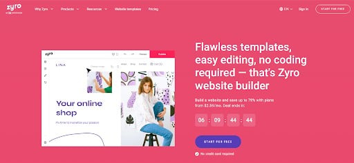
What Makes It Effective: Sticking with software for a moment, let’s take a look at Zyro’s ad for their website building software.
They do a great job of highlighting key features of the software and implying related benefits. The headline hammers home how easy the software is to use (“Flawless templates, easy editing, no coding required”), which implies the benefit of never getting a headache trying to figure out how to do something on your site.
It then features a low price (“save up to 78%”) and a free trial, which implies the benefit of not stressing about the cost.
The ad also creatively uses a countdown timer to push urgency–the discounted deal will run out when the timer hits zero.
And don’t overlook the cool way this ad hints at another benefit–that you’ll make more money if you use this website builder. It doesn’t say this directly that Zyro will make this happen for you, but if you look closely at the image of the website built with Zyro’s software, you’ll see that the website has the tagline, “It’s time to monetize your passion.” That’s next-level Jedi mind trick stuff!
Example 5: Patagonia Kids’ Snow Apparel
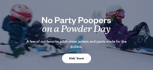
What Makes It Effective: You don’t find a lot of ad copy on huge e-commerce sites like Patagonia, outside of the product descriptions for each item. But this header does a lot in just a few words (and an image) to get you to hit that button to go to the products page.
The image of kids having fun in the snow is the hook that grabs your attention immediately. From there, the conversational language (“no party poopers,” “made for the kiddos”) and low-key approach are a counter-intuitive way to sell you on learning more.
Instead of focusing on value or features, as most product-centric e-commerce marketers would do, this ad simply highlights the benefit–having a lot of fun playing with the kids in the snow.
And, oh by the way, you’re probably going to need some cold-weather gear to do that, so…
Example 6: BODi (formerly Beach Body) App
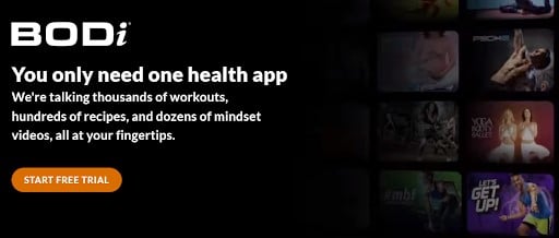
What Makes It Effective: The big benefit is front and center in this ad: if you’re used to having a gym membership, a diet with a related cookbook, and a shelf full of mindset videos, you can now have all of that in one place–with the BODi app.
And you don’t just get one workout, you get thousands to choose from. You don’t just get one cookbook, you get hundreds of recipes. You don’t get a single mindset video, you get dozens. Volume, variety, and convenience, all wrapped up into a single product. And you can start with a free trial.
And oh yeah, I’m guessing the pictures of fit, attractive men and women (“you, too, could look like this in no time”) don’t hurt the conversion rate, either.
Example 7: Ben & Jerry’s Chocolate Therapy Ice Cream
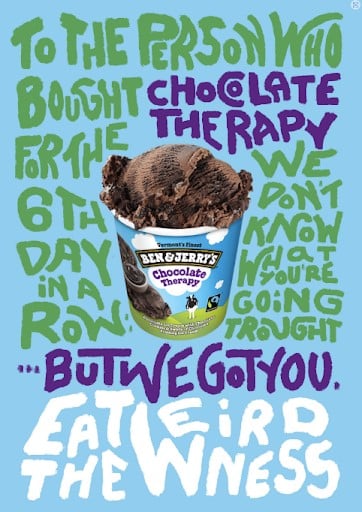
What Makes It Effective: This ad offers a unique twist on addressing pain points and highlighting benefits in ad copy. Generally, the more specific the pain point you address and the more well-described the benefit the reader will receive, the better. But here, Ben & Jerry’s intentionally keeps it wide open: “We don’t know what you’re going through…but we got you.”
The point the ad makes is that ice cream–and more specifically, Ben & Jerry’s Chocolate Therapy ice cream–is always a great emotional support comfort food (I mean, hey, “therapy” is right there in the name), no matter what you’re going through.
The other strong point about this ad is the conversational language and tone and the use of second person (“you”) in the ad. It really does come across like a friend talking you through a rough patch.
Example 8: Smalls Cat Food
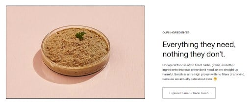
What Makes It Effective: I’ve mentioned multiple times already how powerful it is to focus on the benefit of the product or service for the reader when writing ad copy. But this ad shows that focusing on the benefits to the reader’s pets can work, as well!
One unique aspect of this ad is that it hits both sides of the equation: “Everything they need, nothing they don’t.” Most ad copywriters focus on describing the features that exist in the product, but this ad reminds us that you can also sell the absence of the bad stuff.
Plus, I love the call to action button copy: “Explore Human-Grade Fresh.” That hits home for those cat owners who see their fur babies as another member of the family!
Example 9: Oatly Climate Footprint Ad
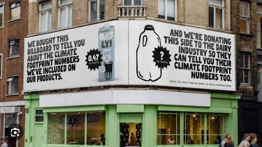
What Makes It Effective: Oatly is a company that produces oat milk, but they’re also well known for their brand voice. In this double billboard ad, Oatly uses their trademark humorous approach to both highlight the company’s climate conscious mission and throw some shade at their competitors, the dairy industry.
It’s a clever combination of mission, benefits, and humor that makes this ad unique. They really thought outside of the carton on this one!
Example 10: Lush Cosmetics Shower Bombs
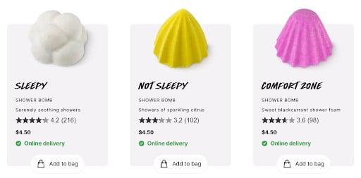
What Makes It Effective: Lush Cosmetics Company does a great job throughout their website of grabbing the reader’s attention and selling them through the senses.
To start with, their products are produced in unique shapes and bright colors that draw the eye. But it’s the ad copy that really brings it home. Check out the way the copy taps into the senses in the header copy: “fizzy, fragrant wonders,” “mood-transforming scent,” “intoxicating fragrance,” “foam in your hand,” “lightly scented skin.”
And even in the spare product descriptions, they continue to entice the reader’s senses (along with adding some alliterative spice): “serenely soothing showers,” “showers of sparkling citrus,” “sweet blackcurrant shower foam.”
Not all companies sell products that appeal to the senses, but if yours does, flaunt it!
Example 11: Bic Lighters
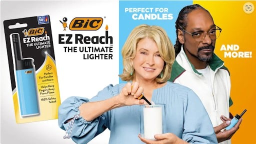
What Makes It Effective: I mentioned Oatly’s use of humor previously. Here, Bic kicks you in the funny bone while tapping into the power of celebrity endorsements. Martha Stewart is known for lighting candles to decorate a home, while Snoop Dogg is well-known for lighting…other materials.
Example 12: Solo Smokeless Stoves TV Ad
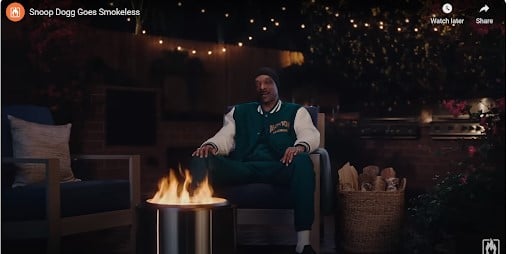
What Makes It Effective: To follow up on the joke from the previous ad, here’s a commercial that also taps into Snoop Dogg’s reputation for his smoking habits.
At the beginning of the commercial, Snoop says, “I have an announcement. I’m giving up smoke.” After a pause, he goes on, “I know what you’re thinking. Snoop, smokie is kinda your whole thing!”
He then goes on to tout the benefits of Solo Smokeless Stove. Clever, funny, celebrity endorsement; this ad checks all the boxes.
Example 13: Duck Duck Go Facebook Ad
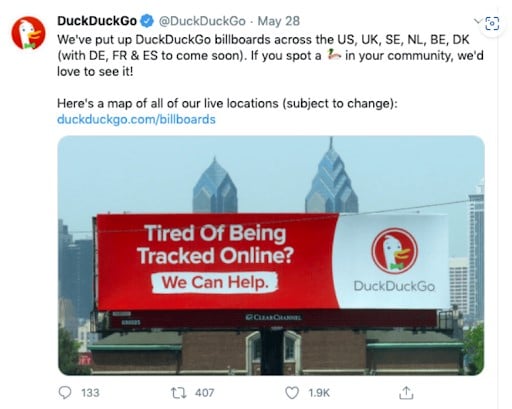
What Makes It Effective: This Facebook ad does double duty. The ad copy in the image of the billboard sells the big benefit of the Duck Duck Go browser–that they don’t track your online browsing behavior like most other browsers do.
Beyond the billboard copy, the post itself asks people who see their billboards to take a picture and send it in, inviting engagement with their community.
Example 14: Breakout Clips Facebook Ad
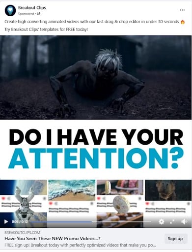
What Makes It Effective: You can’t tell it from the static image above, but if you view this ad on Facebook, the zombie in the main image panel appears to be crawling out of the screen right at your face. So, when the image says, “Do I Have Your Attention?” the answer is definitely “Yes!”
Once the image grabs your attention, the ad copy itself takes over. The headline in the copy hits three selling points in a single line of copy: “Create high converting (it works for your marketing goals) animated videos (not just your run of the mill video clips) with our fast drag & drop editor in under 30 seconds (fast and easy to use).” The ad also highlights the fact that you can start with a free trial.
Example 15: White Label Comedy Marketing Agency Facebook Ad
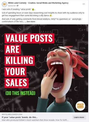
What Makes It Effective: Anyone who has ever been frustrated with trying to get their target market to engage with their brand on social media is going to be attracted to this ad.
There’s a lot of good copywriting going on here, starting with the attention-grabbing image and text: “Value Posts are Killing Your Sales (Do This Instead).” This sends the message to social posters that, by sharing tons of value posts, they’re doing it all wrong–but that there’s another approach that works better. This taps into curiosity and almost forces the reader to check out the body copy of the post.
Once there, they find themselves caught up in a story (“I was sick of creating ‘value posts’”…). Storytelling is a tried and true approach for hooking a reader and keeping them engaged. This narrative hook entices the reader to hit the “read more” link to learn the rest of the story. And of course, that’s where they’ll find the ad’s call to action to check out White Label Comedy’s services. Very well done.
Take Your Ad Copy to the Next Level
In exploring these 15 amazing ad copy examples, we’ve traversed the landscape of persuasive writing that captivates and converts. Each example underscores the power of understanding your audience and crafting messages that resonate on a personal level. From highlighting benefits to tapping into the senses, from humor to story-telling, these techniques of effective ad copy speak directly to the desires and needs of potential customers.
As you venture into the realm of ad copywriting, remember the lessons these examples provide. They’re not just words on a screen; they’re the keys to unlocking deeper connections with your audience and driving your business towards greater success.
Embrace the art of ad copywriting, and watch as your leads transform into loyal customers!
Elevate Your Copywriting Game!
Discover winning strategies and insider tips for writing words that sell - from Mirasee’s very own expert copywriting team!