13 Copywriting Portfolio Examples That Actually Convert
Willy Wood
Originally published in 2023. Updated in February 2026 to reflect current examples and strategic insights.
If you’re building a copywriting portfolio, you’re likely trying to answer a high-stakes question:
How do I present my work in a way that attracts the right clients?
Studying strong portfolio examples is one of the fastest ways to improve your own positioning. But this isn’t just about design or aesthetics. It’s about clarity – who you serve, what results you deliver, and why someone should trust you with their business.
While these examples come from copywriters, the underlying principles apply to any expert or service provider who needs to demonstrate credibility and win clients online.
In this guide, we’re not simply listing copywriter websites. We’re examining what makes these portfolios effective, from niche positioning to proof stacking to case study structure.
As you review these examples, pay attention to:
- How clearly the copywriter defines their audience
- Whether results and outcomes are emphasized
- How credibility is established
- How friction is reduced for potential clients
Because strong portfolios don’t just showcase work – they convert.
Ready? Let’s get started.
13 Copywriting Portfolio Examples That Convert
Niche & Positioning Clarity
Before authority and proof matter, clarity comes first.
The strongest portfolios eliminate confusion by clearly defining who they serve, what they do, and how they’re different.
1. Kelsey O’Halloran

Kelsey O’Halloran’s site makes her positioning immediately clear: she’s a website copywriter who helps specific types of clients refine their messaging.
Above the fold, her headline communicates both focus and audience. She doesn’t try to appeal to everyone – and that’s precisely why the messaging feels confident.
What makes this portfolio convert:
- Clear service focus (website copy + brand messaging)
- Defined ideal client
- Testimonials placed strategically to reinforce trust
- Strong call to action (“book a consultation”) that moves visitors forward
This is a strong example of how clarity of niche reduces friction. Visitors don’t have to guess whether she’s the right fit.
2. Carly Zumar
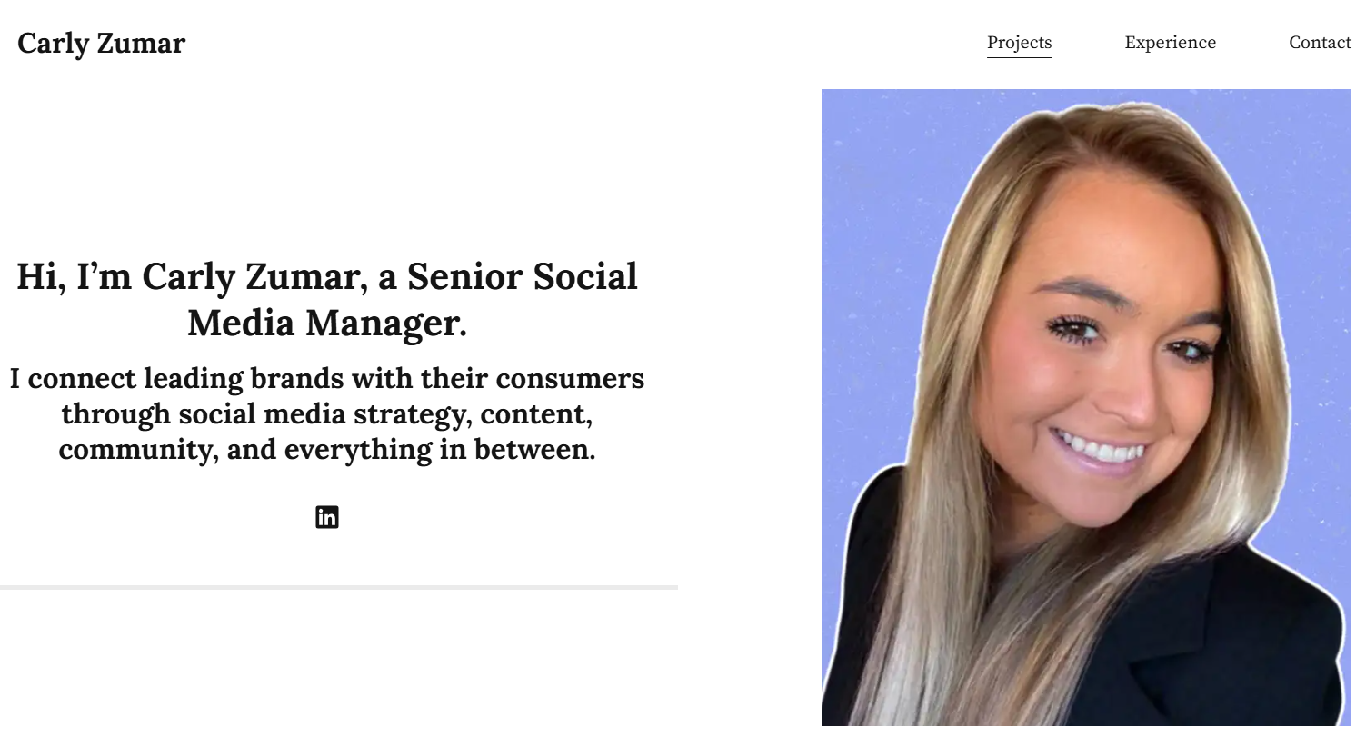
Carly’s homepage doubles as her portfolio and highlights a mix of brand work and campaign experience. Her presentation is clean and direct, with each project clearly labeled and contextualized.
Over time, she has worked with recognizable brands and media companies, which elevates her positioning significantly.
What makes this portfolio convert:
- Strong brand association and recognizable names
- Clear project labeling and context
- Clean, modern layout that keeps focus on the work
- Confident tone without over-explaining
This is a strong example of how experience compounds credibility, and how clear presentation ensures that credibility isn’t buried.
3. Laura Silcock
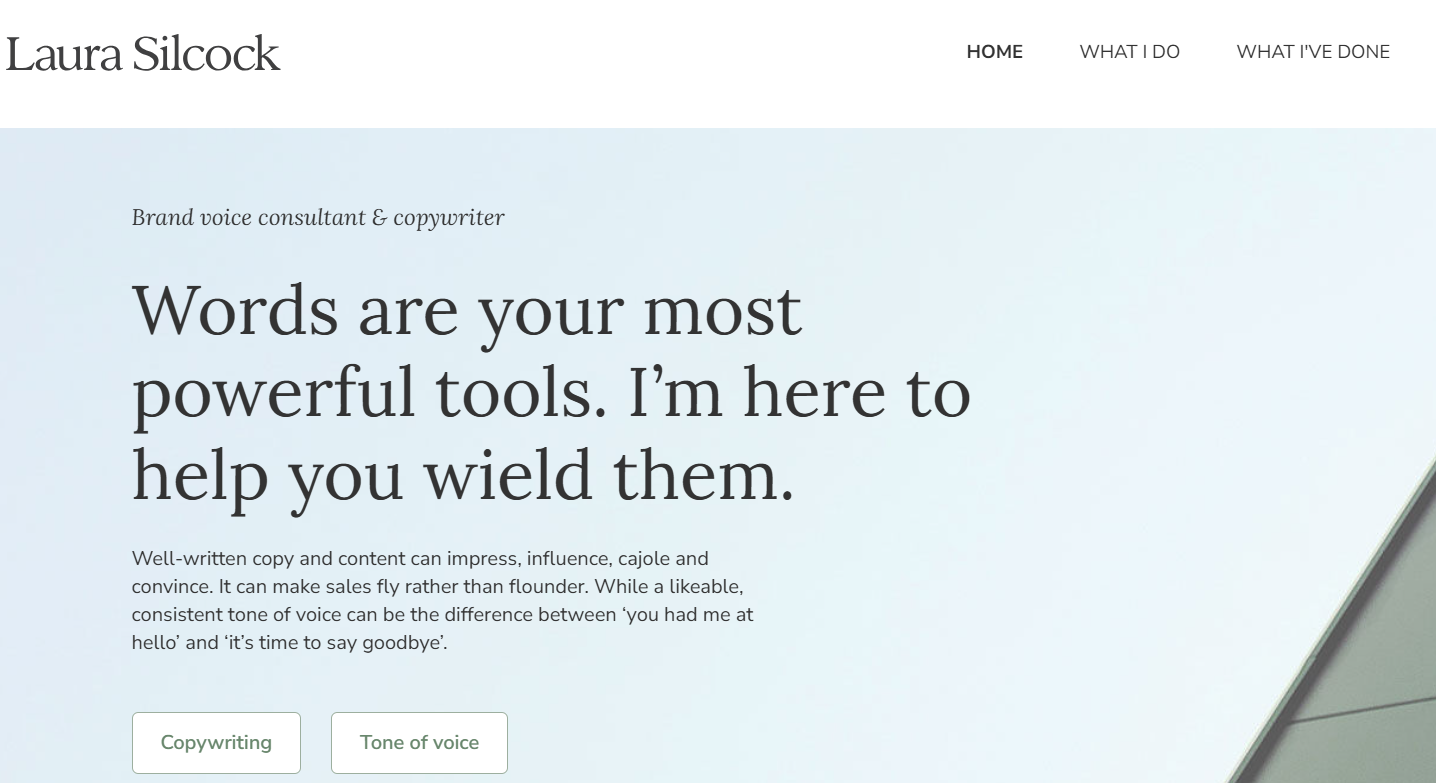
Laura Silcock positions herself not just as a copywriter, but as a brand voice consultant. That subtle distinction elevates her from “writer” to “strategic partner.”
Her messaging consistently reinforces personality and voice, demonstrating her expertise instead of merely claiming it.
What makes this portfolio convert:
- Elevated positioning (“brand voice consultant”)
- Strong, personality-driven copy
- Integrated testimonials
- Clear navigation to services and portfolio
When positioning is precise, the portfolio becomes less about samples and more about fit.
4. Savannah Fonseca
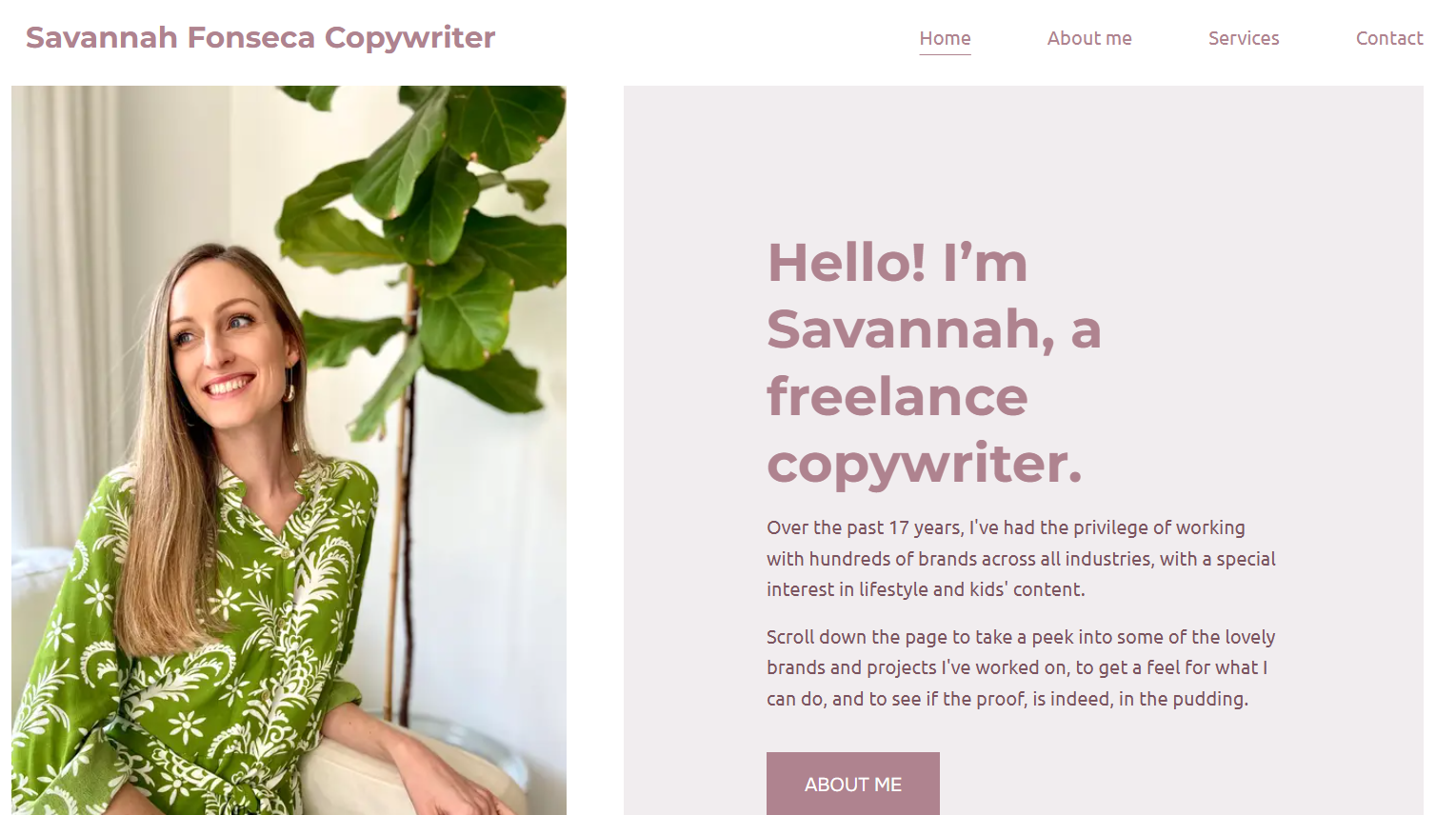
Savannah’s homepage is straightforward and focused. She introduces herself clearly as a freelance copywriter and immediately invites visitors to explore her work.
Her portfolio tiles are organized by project type, making it easy for potential clients to scan relevant categories.
What makes this portfolio convert:
- Direct, simple introduction
- Organized project categories
- Visible testimonials and client logos
- Clear scroll and navigation prompts
This is a strong example of how simplicity supports usability. When structure is intuitive, trust increases.
Notice the pattern in these examples. Each portfolio reduces ambiguity. The audience is clear, the service focus is defined, and the messaging reflects a specific point of view.
Conversion begins with clarity.
Authority & Proof Stacking
These portfolios lean heavily into credibility. Instead of simply showcasing work, they build trust through awards, results, media mentions, and proof of impact.
5. Carline Anglade-Cole
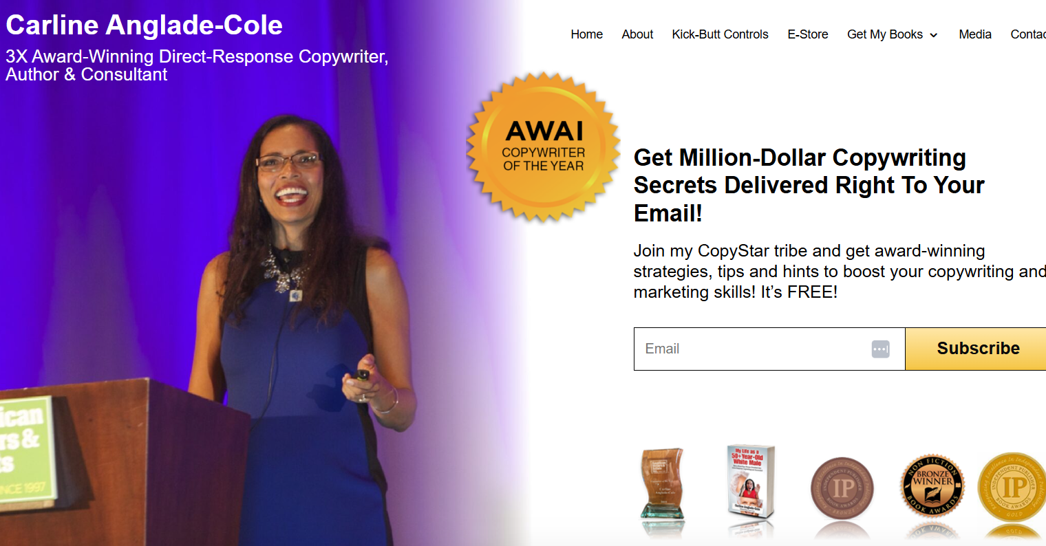
Carline’s homepage is a masterclass in proof stacking.
Before she even explains what she does, visitors encounter awards, media appearances, book covers, podcast features, and high-profile credibility markers. The structure intentionally builds authority layer by layer.
By the time she introduces herself, the visitor already perceives her as elite.
What makes this portfolio convert:
- Strategic placement of awards and recognitions
- Media mentions that signal authority
- High-level testimonials
- Clear value proposition tied to revenue impact
This approach only works when you have substantial proof, but when you do, leading with it can dramatically shorten the trust-building cycle.
6. Ashlyn Carter (Ashlyn Writes)

Ashlyn’s site is expansive and layered. Beyond a standard portfolio, she includes tools, templates, blog content, recommendations, and resources.
Her authority isn’t just shown through past client work – it’s reinforced through ecosystem depth.
She demonstrates expertise by teaching, recommending, and curating.
What makes this portfolio convert:
- Comprehensive resource library
- Clear service packages
- Strong brand personality throughout
- Educational content that builds trust before purchase
This is an example of positioning yourself not just as a service provider, but as a category leader.
7. Jacob McMillen
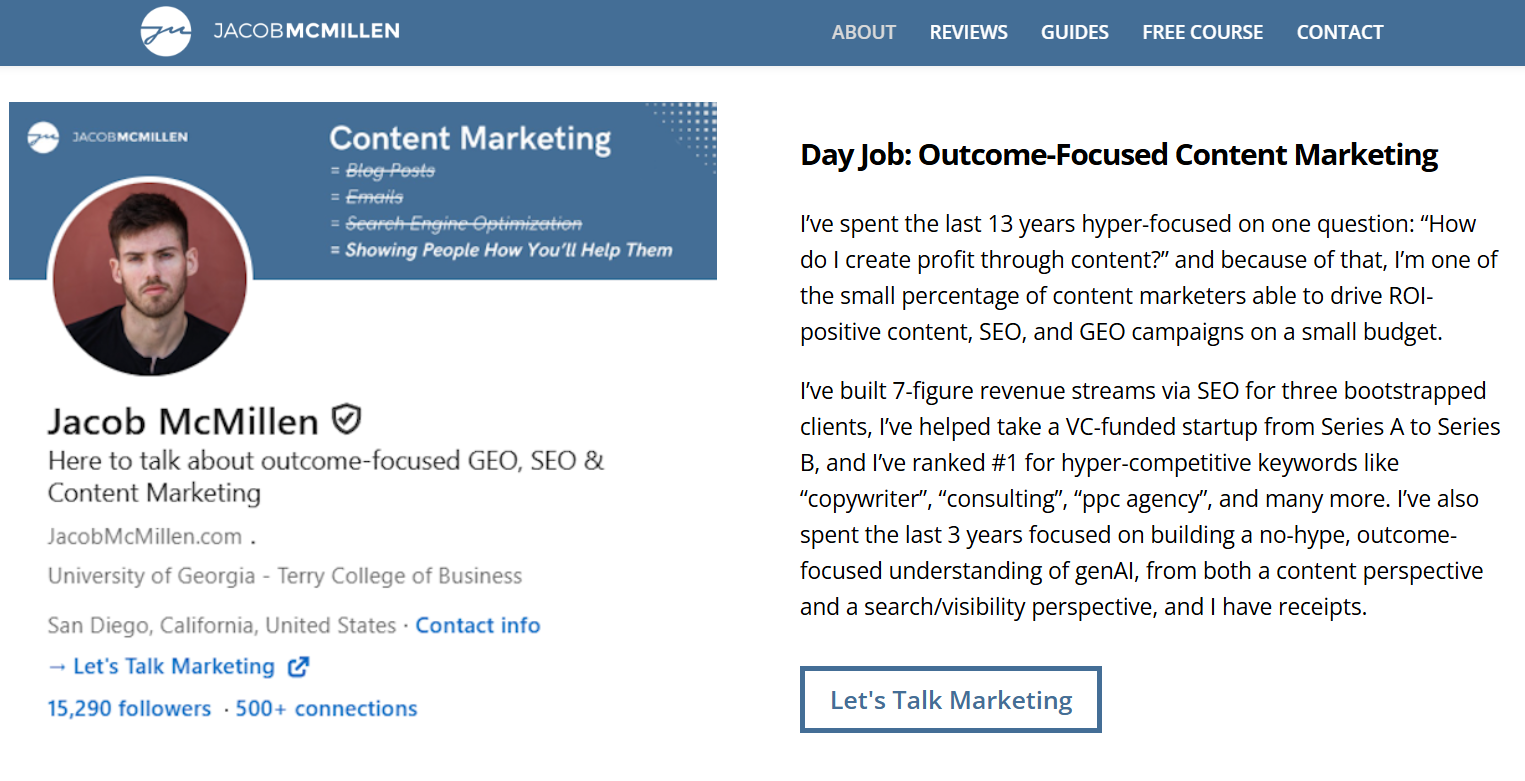
Jacob’s About page doesn’t open with a traditional bio. Instead, he focuses on what he calls his “Day Job: Outcome-Focused Content Marketing.”
He frames his entire positioning around one core question: How do I create profit through content?
He immediately backs this up with specifics, including seven-figure SEO-driven revenue streams, VC-backed startup growth, competitive keyword rankings, and recent focus on generative AI and search visibility.
This is positioning rooted in outcomes, not activity.
What makes this portfolio convert:
- Revenue-driven framing instead of “writing services”
- Concrete performance metrics
- Clear SEO and generative AI expertise
- Strong authority signals without hype
When you position yourself around measurable business impact, you elevate the conversation from creative execution to strategic growth.
8. Gari Cruze
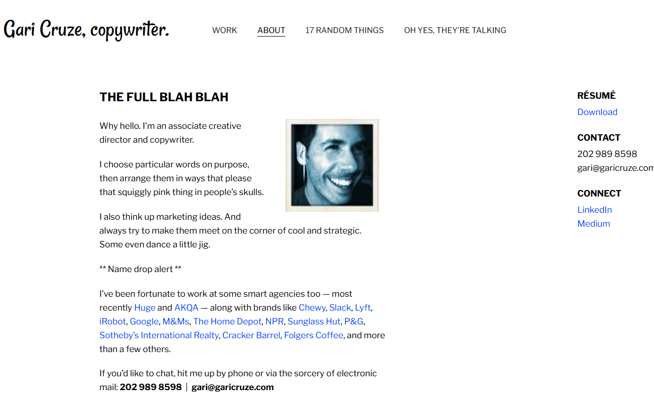
Gari blends credibility with personality.
His About page mixes impressive client lists with humor and distinctive voice. He even includes a “17 Random Things” page that humanizes him without undermining professionalism.
It’s memorable, and memorability builds trust.
What makes this portfolio convert:
- Recognizable client names
- Distinctive voice
- Creative structure
- Case-study-driven portfolio presentation
Authority doesn’t have to feel stiff. When done well, personality strengthens positioning.
In these examples, credibility is not implied – it’s engineered. Awards, outcomes, client logos, and distinctive positioning all accelerate trust.
Strong portfolios don’t just show capability.
They signal authority.
Structure & UX That Reduce Friction
Even strong positioning can fall flat if the portfolio is difficult to navigate.
The examples below show how thoughtful structure, layout, and user experience choices make it easier for potential clients to evaluate fit and take action.
9. Stephen Marsh
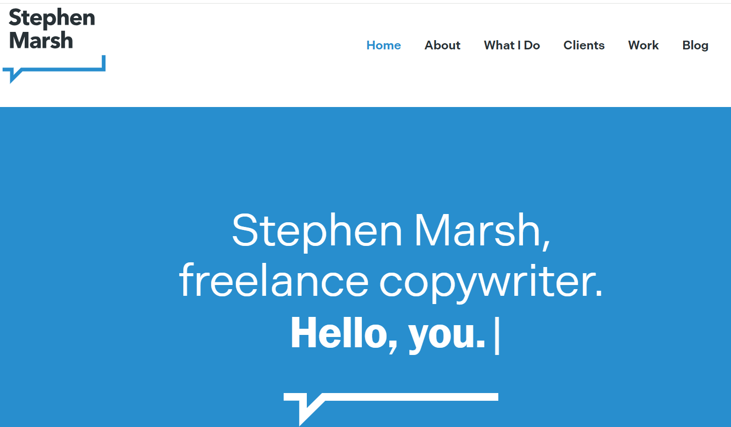
Stephen’s site is minimalist and direct. Unlike image-heavy portfolios, his is largely text-driven, which reinforces a serious, no-frills tone.
His portfolio structure prioritizes clarity over design flair. Navigation is straightforward, and the focus remains squarely on the work itself.
He also maintains a blog, reinforcing his credibility not just as a practitioner, but as someone who thinks and writes about the craft.
What makes this portfolio convert:
- Clean, distraction-free layout
- Clear navigation
- Strong writing-forward presentation
- Ongoing content that reinforces authority
This is a reminder that you don’t need complex visuals to convert. Clear positioning and strong writing often do the heavy lifting.
10. Kayla Dean (The Literary Co.)
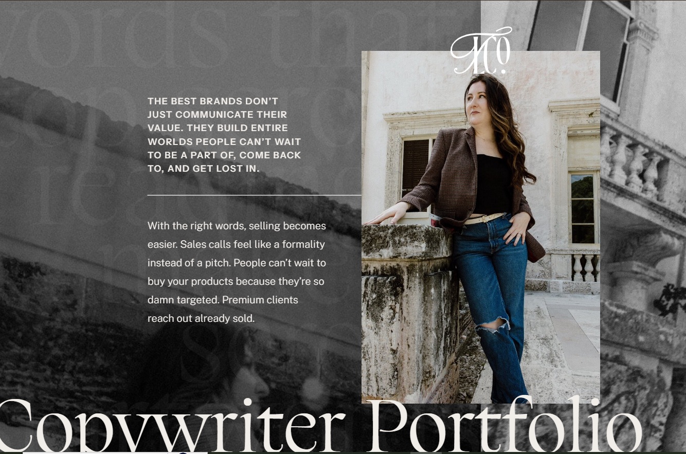
Kayla’s portfolio page centers around client impact and results, with featured projects supported by client stories and testimonials. Each project includes screenshots and clear context about the work and outcomes rather than merely visual samples.
This shifts the portfolio from “look at this work” to “here’s the value this work delivered,” which helps prospects see how Kayla’s messaging and strategic copy contribute to business results.
What makes this portfolio convert:
- Project-level clarity with linked live examples
- Client testimonials that tie messaging to business outcomes
- Featured work organized with real-world context
- Outcome-first framing that reinforces strategic credibility
This example shows how structuring a portfolio around impact and results – not just aesthetics – reduces evaluation friction and reinforces confidence.
11. Anna Rogan
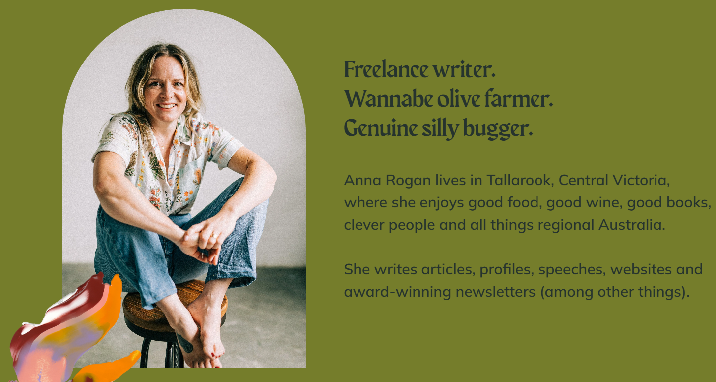
Anna’s portfolio takes a writing-first approach. Rather than relying on heavy visuals or elaborate case study grids, she presents published samples and excerpts in a clean, scrollable format.
Notably, strong testimonials appear before the portfolio section, anchoring credibility before visitors evaluate the work itself.
What makes this portfolio convert:
- Testimonials positioned early
- Clean, text-forward presentation
- Clear demonstration of range
- Minimal design distractions
This structure keeps the focus where it belongs: on the quality of the writing and the trust she has built with clients.
12. Sally M. Fox (Lumen & Fox)
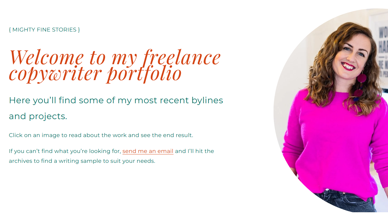
Sally’s portfolio organizes each project using a What? Who? Why? format.
This simple structural choice clarifies the business context behind each project, and not just the creative output.
What makes this portfolio convert:
- Context-first descriptions
- Clear structure
- Concise formatting
- Testimonials integrated alongside examples
In this example, context increases perceived strategic depth.
13. Andy Barton
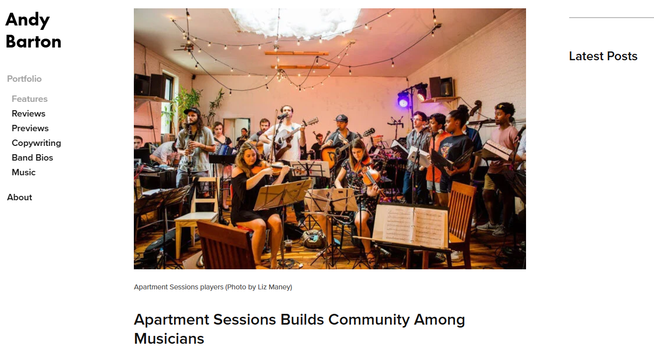
Andy organizes his portfolio by content category rather than case study summaries. Instead of short blurbs linking outward, he presents full writing samples directly within category pages.
This approach works well for prospects who want to evaluate writing style in depth.
What makes this portfolio convert:
- Category-based navigation
- Full-length samples
- Clear specialization focus
- Straightforward presentation
When your structure matches how prospects evaluate work, the decision-making process becomes easier.
Across all thirteen examples, one theme emerges:
Effective portfolios aren’t about volume. They’re about clarity, proof, and ease of evaluation.
Design supports positioning.
Structure supports trust.
Strategy supports conversion.
How Strong Positioning Turns Expertise Into Opportunity
A great portfolio isn’t about aesthetics.
It’s about positioning.
The examples above show that what converts isn’t volume of work or flashy design. It’s clarity of audience, strength of proof, and thoughtful structure that makes evaluation easy.
Whether you’re a copywriter, consultant, coach, or strategist, the principle is the same:
If people can’t quickly understand who you serve, what you do, and the results you create, they won’t move forward.
And in today’s landscape, that clarity matters even more.
Search engines are evolving. AI tools are reshaping how content is discovered and evaluated. Prospects are scanning faster, comparing more options, and relying on signals of credibility to decide who to trust.
Which means your positioning has to do more work than ever.
If you’re using tools like ChatGPT to help draft content, refine messaging, or build your online presence, the strategy behind your positioning becomes even more important.
If you want to understand how to use AI strategically, start with our free AI Quickstart.
It will help you think more clearly about how to combine positioning, messaging, and AI tools so your expertise stands out, instead of blending in.
👉 Get the free AI Quickstart here.
Because ultimately, the goal isn’t just to showcase your work.
It’s to build trust that converts.