How to Create a Powerful Brand Identity For Your Online Courses
Natasha Lane
With all the online courses on the market today, ensuring your course stands out can be quite a challenge. You want to offer a truly valuable learning experience, where your course-takers walk away certain they’ve learned something tangible. But even before that, you first need to pour plenty of effort into getting them to select your course over all your competitors.
Let’s be honest: there are some rather poorly written and executed online courses available. But even if yours is objectively better, if a lower-quality course runs a better marketing campaign, they will likely see better results.
Developing a distinctive brand identity is a powerful way to give your course an edge over all your competitors.
Let’s examine how you can create a brand identity that will help your course stand out, get noticed, and allow you to truly help your audience.
1. Consider Your Brand’s Visual Identity
Start by determining what you want your brand to look like. As humans are highly visual creatures, the smallest details of your online presence, like the color you choose for your logo and the font you use in your headings, will make a huge difference.
Read up a little on color theory and select a shade and hue that best reflects your brand. As for your font choice, a sans serif font will do well. It’s easy to read on any screen and professional enough without being boring. Verdana and Calibri are the usual choices.
Now comes the tricky part. You need to come up with at least one visual element that will be memorable. It can be your logo design, a mascot, or even the layout of your course page. If you’re stuck, consult a designer to help you out.
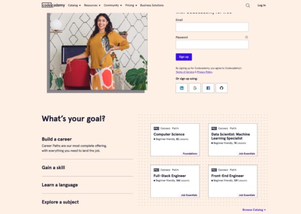
For inspiration and to better grasp what we’re getting at, take a look at Codecademy. Their logo is creative and visually appealing. The simple dots and lines they’ve added to their elements provide that little bit of interest and visual pop that makes the page work significantly better.

2. Put a Face to the Brand
One of the best ways to brand your course is incidentally to utilize the power of personal branding. This will help you gain both personal and brand recognition, help you network and attract the right type of audience, and boost your online visibility.
You will also be infinitely more relatable and trustworthy. Most course-takers prefer to know who their teacher is right off the bat and will do a bit of digging to see what the teacher is like as a person. Through personal branding, you will widen your reach and make it easier to engage with you.
Plus, it makes marketing a little bit easier, as everything you post online also benefits your brand. You will reduce the time you spend promoting your course, as your personal posts will help. Plus, you can significantly widen your reach, as people will follow both your personal and your course presence.
However, you also need to be cautious about the way you engage with people online and seriously think about any personal and private information you share. You might consider a completely private account that you’ll use to communicate with friends and family.
AMZ Pathfinder is a great example of adding a face to the (brand) name. They show their clients who the team is and who they can expect to work with, helping them connect more easily and form a relationship and opinion even before they’ve engaged with the brand.

3. Highlight Your Credentials
Your brand identity also needs to revolve around your credentials, experience, and capabilities. Especially if you’ve had no formal training in the subject you’re teaching, you need to demonstrate your skills and convince your audience that they can learn a lot from you.
If you do have a degree or a certificate, highlight it as early on as possible. The sooner leads start looking at you as an expert, the better an impact your marketing materials will have.
Make sure you don’t sound like you’re bragging, though. You don’t want your audience to feel inferior or intimidated by you. The goal is to reassure them that you are capable of imparting knowledge that will benefit them.
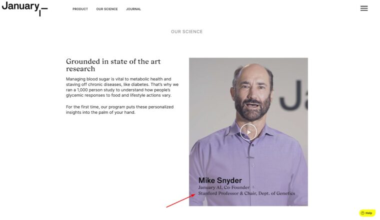
Take a look at how January has done it. They highlight the credentials of their co-founder in an unobtrusive and natural manner, yet as soon as you learn that their product is backed by a Stanford professor and department chair, you start to take their message and articles more to heart.

4. Write a Compelling Tagline
While you will certainly need to write a lot of content describing your course, its aims and goals, methodology, chapters, and expected outcomes, you will also need to distill the entirety of the course into one compelling sentence. Two sentences tops.
In marketing, this is known as your tagline, and it serves to communicate your brand identity in a nutshell. It allows you to instantly capture the attention of your audience and to save everyone time by telling them upfront what your course is about.
For instance, if you are teaching an advanced course, you want all beginners to know this right off the bat. This is why the word “advanced” should make it into the tagline. Try to think like a marketer. What is it about your course that would inspire your target audience to check it out and potentially sign up?
Over time, as you expand your student pool and as more and more people take the course, you can rewrite your tagline to better fit what you have learned about them and their needs and wants.
To see what a well-written tagline looks like, take a look at FE International’s buy a website page. They have captured the essence of their message in a single sentence by choosing a positive approach that speaks to the goals of their audience — wanting to buy a business with a hand holding and supportive process.

Your goal is to come up with something just as impactful that will make leads take notice and keep reading.
5. Discourage the Wrong Attendees
This seems like the right place to talk about the importance of filtering out your audience and ensuring that only those who will benefit from your course end up taking it. The above example about promoting advanced courses applies here as well: make sure that your brand identity reflects who you are targeting.
Your course won’t be equally beneficial to everyone who takes it, and you don’t necessarily need to focus on a very narrow ideal customer. However, you do need to prevent the wrong kind of people from taking it, as their dissatisfaction and disappointment will reflect very negatively on you and the course.
Your leads won’t know that the bad review they are reading comes from someone who didn’t have the right knowledge or skills to learn from you, and you will risk losing attendees without proper filtering.
Fortunately, preempting the issue is simple. Take a look at how Ahrefs describes their course. They are upfront about who the course will benefit: content marketing professionals, bloggers and freelance writers and digital marketing team leaders. If you happen to work in the digital marketing space but don’t have the level of understanding it takes (i.e. you’re not a team lead or don’t work in content marketing), you may feel a bit lost and not benefit from the course as much.
6. Set Up an FAQ Section
FAQ sections on your course website are a great element to have for several reasons. First, they let you overcome a lot of conversion obstacles early on. They also let you deepen your brand identity.
The way you choose the questions and how you answer them will speak volumes about the brand and what audiences can expect from you. If you use simple, everyday terms, they’ll know you won’t use unintelligible jargon in the course. And if you sound very friendly and use a lot of emojis, they’ll see you as an approachable personality.
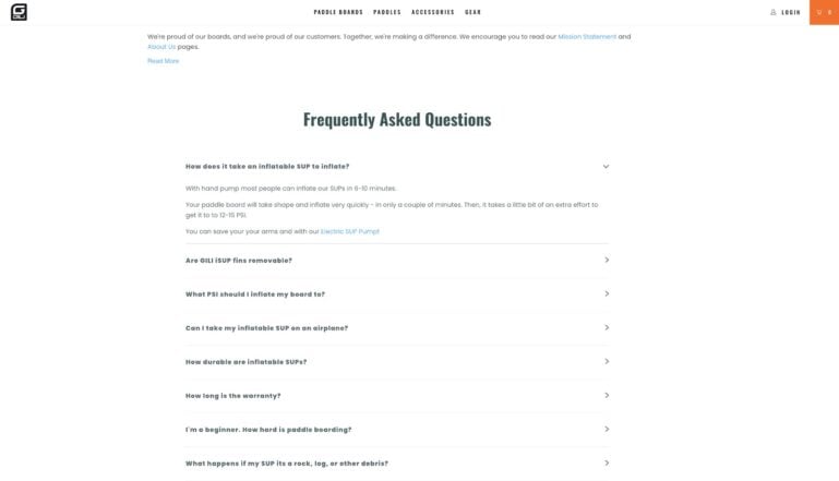
The FAQ section is a unique space where you can let your personality shine and be of true value to your audience. Take a look at Gili and how well they have constructed theirs.

Their answers reflect the laid-back nature of their brand, and the questions they’ve chosen have clearly been asked by real people.
7. Feature a Reviews Section
Finally, you also want to use the reviews section of your course page to highlight your brand identity. You will need to select the review you want to shine the spotlight on, as well as to point visitors to other reviews they can check out.
Your choice of review will again depend on how you want people to perceive you. Choose one that sounds honest and enthusiastic and comes from someone who truly represents your audience. Get them to testify about the value they’ve seen from the course and how it has helped them solve a problem.
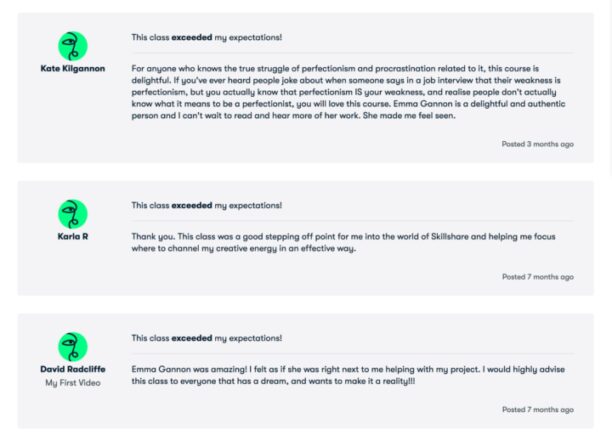
Take a look at the review on Emma Gannon’s course on Skillshare.

Having taken it myself, I can testify that this review sells the course perfectly and speaks directly to the majority of creatives who are looking to work through their insecurities and combat the setbacks that come with creative talent.
Ready to Create Your Powerful Brand Identity?
Creating a powerful brand identity for your online course is not an overnight process. It can take months, if not years, to position yourself as the expert you want to be seen as.
However, if you think through all these examples and start to implement the ones that most appeal to you as a teacher and online presence, you’ll be well on your way to creating a powerful and distinctive brand identity.